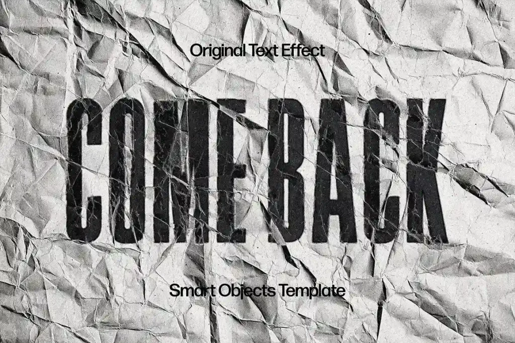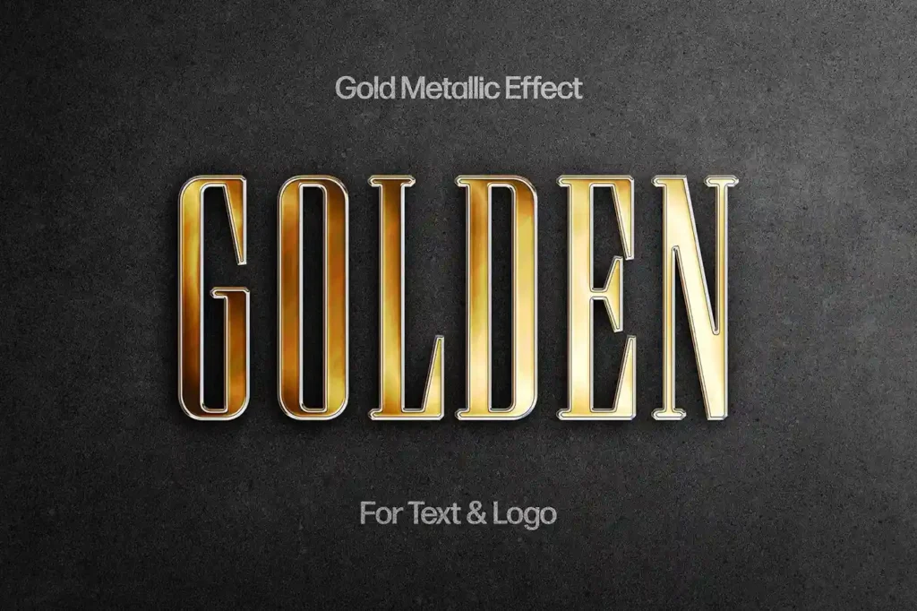
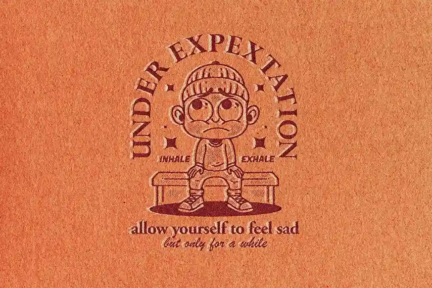
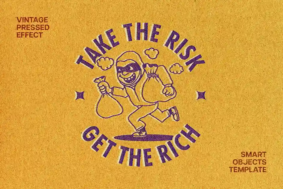
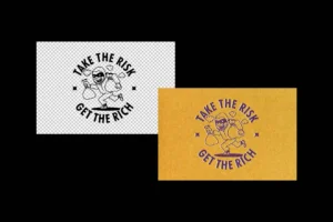
Description
Perfect edges can sometimes make a design feel too digital.
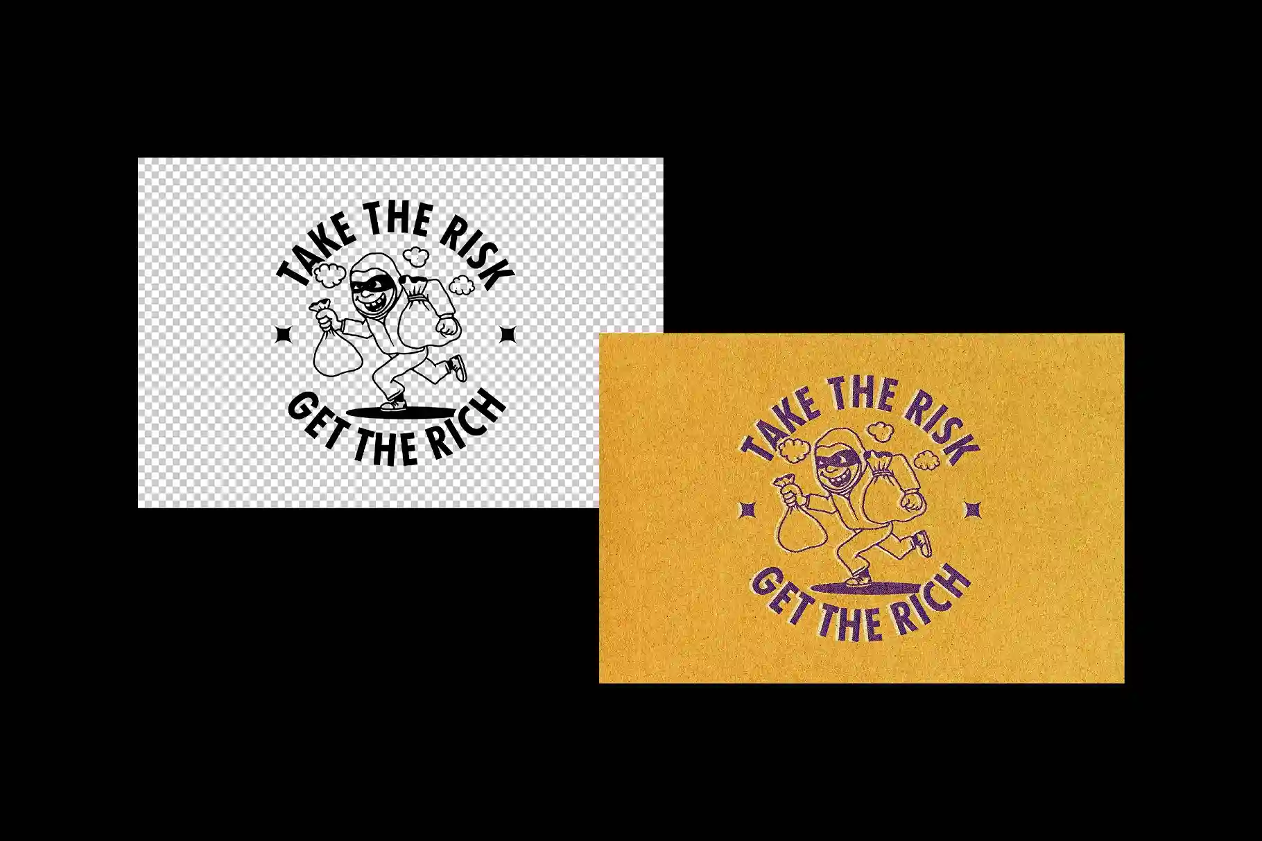
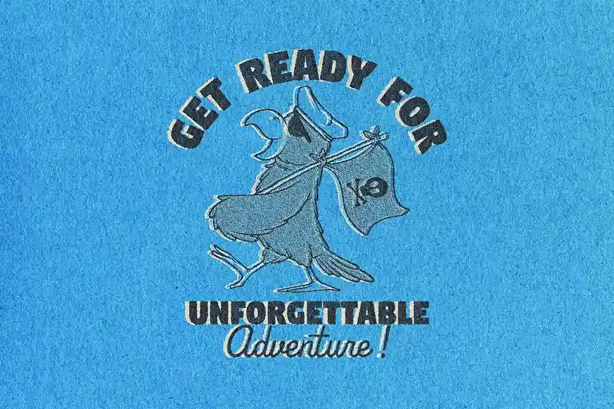
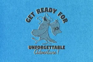
This Free Vintage Pressed Text Effect PSD adds the small irregularities associated with older print processes—softened edges, uneven ink character, and a textured paper appearance. Instead of looking freshly placed on a screen, the typography feels as if it has been physically pressed or printed onto a surface.
The effect works especially well with designs that need character rather than perfect digital precision.
The Imperfections Are the Point
Vintage print styles are rarely completely uniform.
Ink may appear slightly stronger in one area and softer in another. Fine details can lose some sharpness, and the texture of the paper can affect the appearance of the letters.
This PSD recreates that general visual character without requiring you to build the texture manually.
Use it when a clean vector logo or perfectly sharp headline feels too polished for the mood of the project.
Add Your Design With a Smart Object
Customisation is handled through a Smart Object in Adobe Photoshop.
Open the designated layer, replace the sample artwork with your own text or design, save it, and return to the main PSD. The prepared texture and pressed-style treatment are applied automatically.
The file is layered and organised, making it easier to adjust the result without rebuilding the effect from scratch.
Key Features
- Vintage pressed-style text effect
- Editable PSD file
- Smart Object customization
- Textured paper appearance
- Soft and imperfect ink character
- Organised Photoshop layers
- High-resolution artwork
- Suitable for personal and commercial projects
Where It Works Best
Try this effect with:
- Vintage logos
- Packaging concepts
- Event posters
- Editorial headlines
- Apparel graphics
- Label designs
- Book covers
- Flyers
- Heritage branding
- Portfolio presentations
It can also create an interesting contrast in modern layouts. A clean grid combined with one textured headline can feel more intentional than making the entire design look old.
Designer Tip
Start with simpler artwork than you think you need.
Very thin lines, tiny lettering, and highly detailed illustrations can lose clarity once the pressed texture is applied. Bold letterforms and clear shapes usually give the texture more room to show.
If your design already contains heavy distressing, scratches, and rough textures, try using a cleaner version first. Let the PSD create the imperfection instead of stacking multiple distressed effects on top of each other.
Don’t Make Every Print Look Ancient
A vintage effect doesn’t require a complete retro design.
You can apply the pressed treatment to one logo or headline while keeping the rest of the layout clean and contemporary. This often makes the texture more noticeable and prevents the project from feeling like a collection of vintage clichés.
The effect can support the design without becoming the entire design.
Check the Texture at Actual Size
Texture can look very different when zoomed in.
At 200% or 300%, every ink variation may look impressive, but some of those details can disappear when the design is viewed at its final size.
Before finishing, check the artwork at the dimensions you actually plan to use. A poster title, packaging label, and small social graphic may each need a different level of texture.
Technical Details
- File Format: PSD
- Effect Style: Vintage pressed print
- Editing Method: Smart Object
- Texture: Paper and imperfect ink appearance
- Resolution: High resolution
- Software Required: Adobe Photoshop
- Layer Structure: Organised and editable
- Best With: Bold text, logos, and simple graphic shapes
- License: Free for personal and commercial use
This vintage pressed text effect works because it removes some of the digital perfection from your artwork. Start with a clean design, let the texture introduce the irregularities, and check the final result at real size before deciding how much imperfection is enough