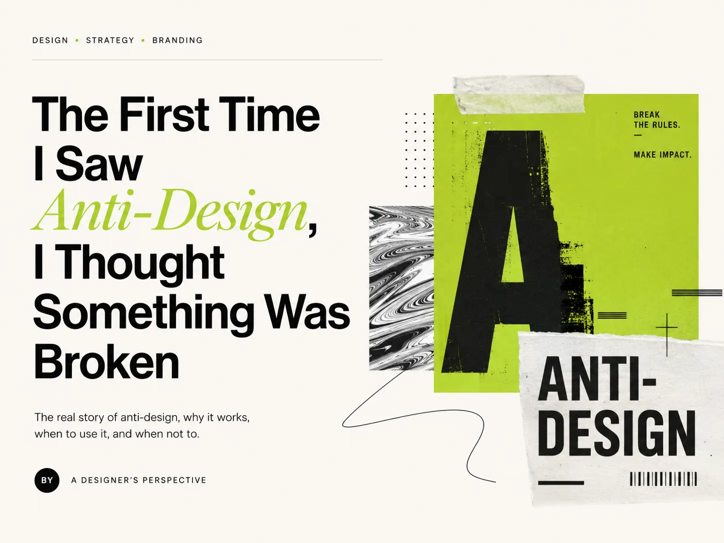
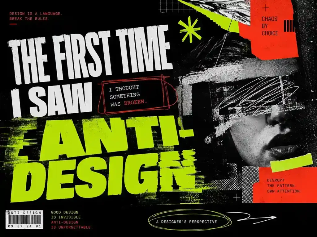
The First Time I Saw Anti-Design, I Thought Something Was Broken
Three years ago, I was scrolling through Instagram and a post stopped me cold.
The font was stretched. The colors were clashing. The layout made zero sense. My first thought was that someone had accidentally hit the wrong button in their design tool.
Then it hit me — I’m a graphic designer, and I stopped scrolling. That was the whole point.
That post wasn’t some amateur’s mistake. It was anti-design — deliberately ugly, deliberately chaotic, deliberately scroll-stopping.
I had mixed feelings about it, honestly. Part of me loved it, part of me didn’t. Because as someone who follows grids, color theory, and all the rules you’re supposed to follow — seeing something that threw all of that out felt both wrong and right at the same time.
But I kept watching it. Three years of daily design work later, here’s everything I actually know about anti-design — not theory, not textbook definitions. Just the real stuff.
The Short Answer (If You’re in a Hurry)
Anti-design is a pattern interrupt, not a product. Use it to stop the scroll — not to close the sale.
If that one line clicked, you already have the core idea. Everything below is just the explanation.
So What Actually Is Anti-Design?
The simple version: anti-design is when you deliberately break the rules that define “good design” — grids, typography hierarchy, color harmony, clean whitespace. All of it.
But here’s the part most people miss.
Anti-design is not about not knowing the rules. It’s about knowing the rules so well that you can confidently break them on purpose.
It’s a rebellion — and every rebellion has a reason behind it. In the 1960s, Italian designers pushed back against modernism. In the 1990s, grunge and punk rejected corporate polish. In 2024, Charli XCX’s blurry green Brat cover defined an entire summer aesthetic just by looking “wrong.”
Every single time, the same thing happened — when “perfect design” became the norm, someone showed up and said, “I don’t want this perfection.” And that disruption worked.
The same thing is happening right now. Just faster, louder, and through social media.
“Intentionally Ugly” vs “Accidentally Bad” — There’s a Real Difference
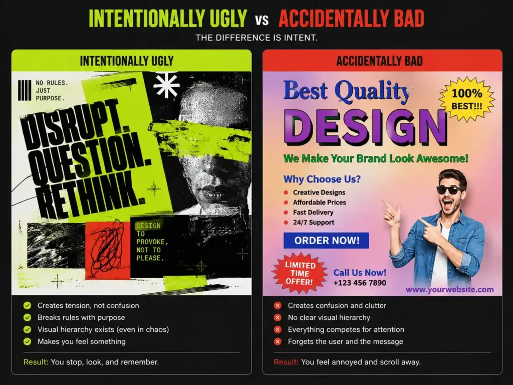
This is the question I get asked the most — from clients and other designers. And the confusion is valid because both can look the same on the surface.
Here’s how I break it down. Three things separate them:
1. Tension vs. Confusion — The Jazz Effect
An accidentally bad design creates confusion. There’s no visual hierarchy, the user gets frustrated, and the message doesn’t land.
An intentionally ugly design creates tension.
Think of it like jazz music. When a beginner plays the wrong notes, it’s just noise. But when a pro musician deliberately hits off-notes, they’re building intentional tension that keeps the listener hooked. Anti-design works the same way — you break the rules deliberately to interrupt the user’s pattern, but their focus lands exactly where you want it.
2. The Hidden Visual Weight
A badly designed piece is completely out of balance. Everything is trying to get noticed at the same time, so nothing actually stands out.
In an intentional anti-design piece — even if the grid is destroyed and colors are clashing — the visual balance is always intact somewhere underneath. If a font is brutally stretched or clashing colors are used, their placement has a hidden calculation behind it. They’re balanced against other layers you might not even notice. It’s chaos, but controlled chaos.
3. Ignorance vs. Intent
This is the biggest one.
Bad design comes from ignorance — not knowing color theory, kerning, or basic contrast rules. Intentionally ugly design is the result of mastering those rules first and then confidently challenging them.
When you see accidentally bad design, you think: “Why did they get the basics wrong?” When you see an intentionally ugly design, you understand: “They took a bold risk on purpose.”
That’s the line. And once you see it, you can’t unsee it.
Why Anti-Design Is a Gold Mine on Social Media
Instagram and LinkedIn today are full of the same thing — perfectly aligned grids, Canva templates, aesthetic gradients, clean sans-serif fonts everywhere.
Our brains have developed a shortcut for this. Anything that looks too polished gets filtered out as an “ad” or “boring content” before we even consciously register it. We literally stop noticing perfection.
So when one raw, chaotic, brutalist image shows up in that feed, the brain gets a jolt. The thumb stops. That’s the pattern interrupt.
The specific things that stop the scroll:
Typography: Instead of safe, readable fonts — stretched, distorted, or mismatched fonts. Weird kerning. Text aggressively overlaps faces and main subjects. Mixing serif, brutalist, and pixelated fonts in the same carousel with odd spacing.
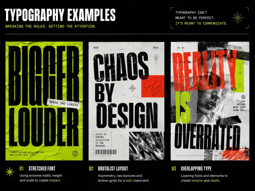
Layout: Full grid murder. Elements are placed exactly against the “safe zones.” Asymmetrical layouts where the whitespace creates awkwardness instead of breathing room.
Color: Instead of harmonious pastels — “acid graphics.” Bright neon green with harsh red. Highly saturated color pairings that intentionally clash and sting the eyes a little.
And one more thing — when a social media trend is running, brands optimise their content around it. That’s also a type of anti-design in action. You’re taking an existing pattern and breaking it just enough to fit your brand’s voice. You get the reach, you get the shares.
Zara: The Perfect Example of Anti-Design in the Wrong Place
If you want to see what happens when anti-design ends up where it shouldn’t — Zara’s website is your case study.
Honestly, Zara’s website feels less like a shopping site and more like some strange fashion magazine experiment. The image cropping makes no sense. Text overlaps randomly everywhere. Finding basic navigation feels like a puzzle.
The golden rule of e-commerce is simple: get the customer to the Buy button without friction. On Zara’s site, customers get frustrated and close the tab.
But here’s where it gets interesting.
Zara’s brand sticks in your head. It’s unique. Nobody forgets it. For brand recall, it genuinely works — it’s a smart move.
So my honest, mixed take: Brand recall — 10/10. Usability — 0/10.
That’s the exact mistake anti-design can lead you into. The chaos creates hype and gets people talking. But when the user actually comes to buy something, they abandon the cart and leave. You paid for “cool” with your conversion rate.
Where It Works and Where It Completely Backfires
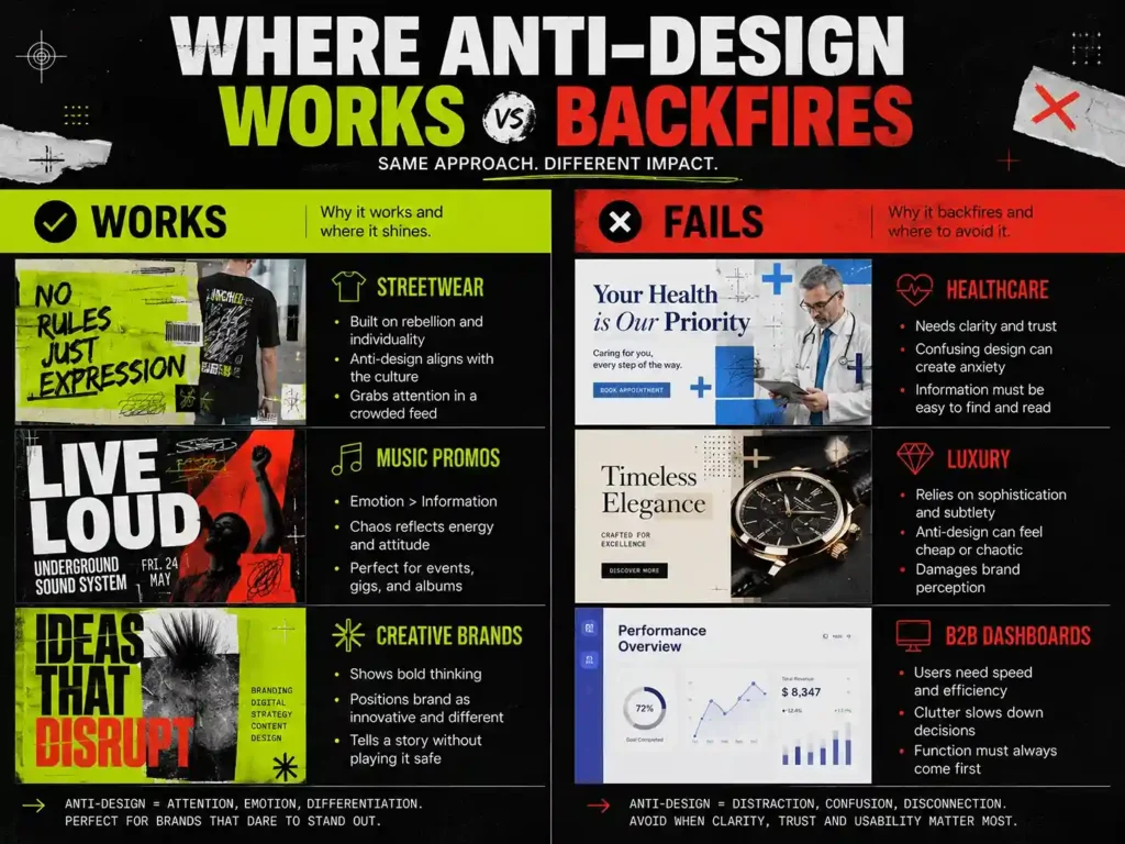
Working across different clients every day, this becomes clear fast. Anti-design is a double-edged sword.
Green Flags — Where It Actually Works
Creative platforms and digital marketplaces: When it’s a platform built by creators for creators, a brutalist or raw anti-design vibe clicks naturally. It signals the community that this isn’t another boring corporate product. It builds trust with the right audience.
Streetwear, hype drops, underground music promos: The audience here isn’t looking for perfection. They want raw authenticity. Anti-design creates the FOMO and energy that makes people pay attention.
Social media hooks and carousels: For pure top-of-funnel awareness — when you just need someone to stop and look — this is the best tool you have.
Red Flags — Where It Kills Credibility
Healthcare and cosmetic procedures: Clashing colors and pixelated fonts on a cosmetic surgeon’s social media? Patient trust goes to zero immediately. Safety, precision, and cleanliness are what the audience needs to feel — clean and accessible design is the only option here.
Luxury brands: Premium feel comes from whitespace and elegance. Anti-design makes high-end products look cheap and unfinished.
B2B platforms: Other businesses need clear data, fast loading, and smooth navigation. They don’t have time to decode weird fonts. Chaos is a conversion killer here.
Context is everything. Hype projects are where rule-breaking is fun. But when a client’s business runs on trust, safety, or premium quality, clean UI wins—every time.
Anti-Design and Accessibility — Can They Actually Work Together?
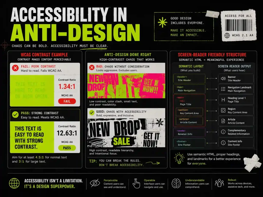
This is the conversation that doesn’t happen enough in design circles, and it should.
When a brand uses anti-design and chaotic colours, missing menus, and weird fonts that end up making the site unusable for people with poor eyesight or colour blindness, that’s both technically and ethically wrong.
Think of it this way: you’re building a public space with no wheelchair access, just because the building looks more aesthetic without the ramp.
But that doesn’t mean anti-design and accessibility can’t exist together.
“Accessible Brutalism” is completely possible. You don’t have to sacrifice usability to keep the aesthetic.
Here’s what actually works:
High-contrast chaos: Clashing colors are part of the anti-design DNA — that’s fine. But the WCAG 4.5:1 contrast ratio still needs to hold. Instead of light yellow text on neon pink — put harsh neon text on a pitch black background. The vibe stays jarring and raw, but someone with color blindness can still read it.
The typography split: Don’t throw chaotic fonts at the entire layout at once. Use the stretched, glitchy, brutalist typography in your hero banners and hooks for the pattern interrupt. But keep body copy, menu items, and CTA buttons in a clean, bold, readable sans-serif. You get the tension and keep the readability.
Clean backend, chaotic frontend: The frontend can be full visual chaos — but screen readers need clean semantic HTML and proper ARIA labels in the backend. No matter how rule-breaking the visual layout is, a clean backend means visually impaired users can still navigate through a screen reader, and your SEO indexing doesn’t take a hit either.
The best designers are the ones brave enough to break rules — but who care enough about real people that nobody’s experience gets broken in the process.
Is Anti-Design a Passing Trend?
Flat design came and went. Neumorphism had its moment and disappeared. So is anti-design next?
My take is different.
Anti-design isn’t a fixed aesthetic. It doesn’t have one specific look. It’s a philosophy of rule-breaking. So whenever a new designer pushes outside the boundaries of whatever the current “traditional rules” are — that will be called anti-design. The name might change, the essence stays.
It’s a permanent rebellion. Because every time design becomes “too polished” or “too predictable,” someone shows up and breaks the mold. That has happened in every design era without exception.
Anti-design isn’t going anywhere. It just keeps changing what it’s rebelling against.
What Happens to Anti-Design When AI Takes Over?
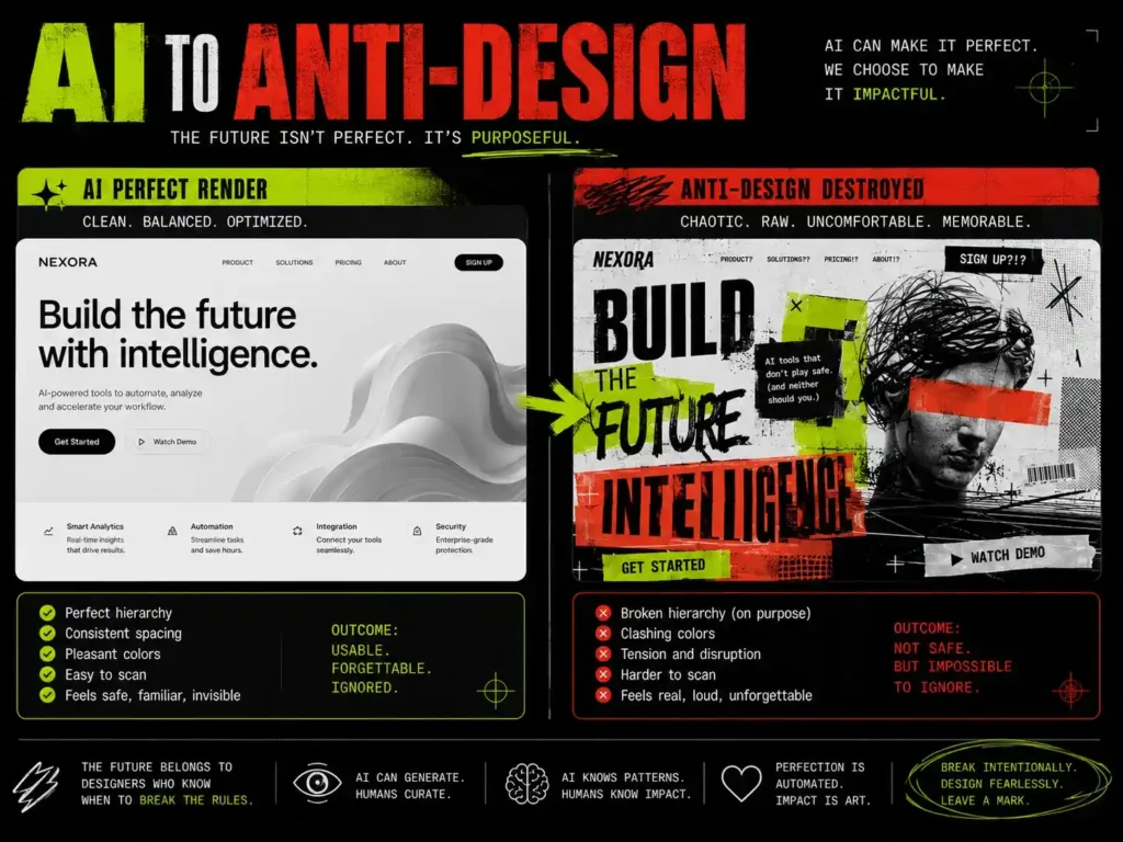
This is the part I find genuinely exciting to think about.
1. Perfection Is About to Get Cheap
“Good design” used to be expensive — it needed real skills and real time. Today, locally run AI models can generate a flawless, hyper-realistic, perfectly lit visual in seconds. When anyone can get perfect instantly and for free, perfection gets commoditised.
Everyone’s feeds will start looking like the same “perfect.” Flawlessness will start feeling boring.
That’s when human imperfection — raw textures, weird layouts, asymmetrical typography — becomes a premium signal. When people see something imperfect, they’ll think: “A real person made this. Not a prompt.”
Anti-design will become Human Proof-of-Work.
2. The Next Rebellion Is Against the Algorithm
For the last few years, anti-design was a rebellion against grids and Canva templates. In the next few years, it’ll be a rebellion against AI logic and algorithms.
AI models train on data, so they always output something safe, predictable, and mathematically average. Future anti-design will create things that an AI’s brain simply cannot process — bizarre cultural context mash-ups, deep internet lore, visual paradoxes that don’t exist anywhere in any training data.
3. Tactile Anti-Design
Here’s the new thing I see coming — creators will use AI to make perfect assets, then deliberately destroy them. Generate a perfect 3D render with AI, print it out, physically crush the paper, scan it on a flatbed scanner, bring it back into the digital workflow, slap harsh typography on top.
AI generates the perfection. The designer breaks that perfection to give it a soul.
For the last few years, people broke rules to stand out. In the next few years, people will break rules to prove they’re human.
One Honest Piece of Advice
If you’re a designer sitting on the fence about anti-design — trying to figure out if you should try it or not — remember this one thing:
“Don’t marry the aesthetic. Marry the objective.”
The biggest mistake designers make is turning a visual trend into their identity. If anti-design clicks with you, suddenly, every canvas gets chaos thrown at it. But anti-design isn’t an ideology you need to defend — it’s a hammer in your toolkit. And you can’t cut vegetables with a hammer.
Look at your own work. When you’re designing for a client in healthcare or managing visual branding for a luxury product, the audience needs trust, safety, and elegance. Breaking rules there because it “looks cool” is just not smart.
But when you’re building hype for a creative platform, a drop, or a community that respects the “no rules” vibe, you have full freedom. Use it.
Two things that always hold:
1. Read the audience, not your own ego: If the audience is looking for trust, give them perfection. If the audience is burnt out on polished feeds and wants something raw — tear the screen open.
2. Master the rules first, then break them: That’s the only real difference between accidentally bad and intentionally ugly. When you understand grid and color theory so well that your eyes catch violations automatically, then breaking those rules becomes art. Before that, it’s just a bad design.
Design is a service. Self-expression comes after. If your design is hitting the client’s goal — whether it’s ugly or clean — you’re a good designer.
Frequently Asked Questions
Q: Is anti-design the same as brutalism? Brutalism is a term from architecture — heavy, raw, no ornament. Anti-design is much broader. It’s the philosophy of breaking any rule, not one specific look. They overlap a lot, but they’re not the same thing. Brutalism is an aesthetic. Anti-design is a mindset.
Q: Does anti-design actually work on social media? Yes — but only at the awareness level. At the top of the funnel, it patterns interrupt the scroll and get people to stop. But once someone is actually trying to buy something or reach out, a clean and accessible design is what converts. Anti-design gets attention. Clear design closes.
Q: Can anti-design hurt your SEO? Not directly. But if the chaotic design drives bounce rates up or slows your page down, SEO takes an indirect hit. Keep the backend clean. The frontend can do whatever it wants.
Q: Should beginners try anti-design? Get the foundations solid first — color theory, typography, grid. When the rules are clear enough that your eye catches violations automatically, breaking them intentionally actually lands. Without that foundation, the chaos just looks like a mistake.
Q: Can anti-design and accessibility work together? Yes. High contrast clashing colors can still pass WCAG ratios. Chaotic hero sections can sit next to clean, readable body copy. Visual chaos on the frontend can coexist with properly structured semantic HTML in the backend. It’s called Accessible Brutalism — and it works.
Q: Is anti-design just a trend that’ll fade? It’s not a fixed look, so it can’t really “fade” the way flat design or neumorphism did. It’s rule-breaking as a philosophy. As long as design rules exist, someone will break them — and whatever they make will be called anti-design. The name stays, even when the look changes.