If you’ve ever opened a design project and thought, “I need something that looks polished but not boring” — serif fonts are usually the answer.
They carry weight. They feel trustworthy. Whether you’re designing a logo, laying out a book, building a website, or crafting an editorial spread, a good serif font immediately elevates the whole thing.
The even better news? You don’t have to spend a single rupee (or dollar) to get your hands on some genuinely excellent ones.
This guide rounds up the best free serif fonts available right now — curated by use case, so you can find the right one for the right job. We’ve also covered how to install them, how to pair them, and what the license actually means before you go using them in client work.
What are the best free serif fonts?
The best free serif fonts include Merriweather, Lora, Bitter, Butler, Vollkorn, Bree Serif, YoungSerif, and Fénix. These cover everything from web body text to high-contrast display headlines. Most are available under the SIL Open Font License, meaning they’re free for both personal and commercial use. You’ll find download links for each one throughout this guide.
What Are Serif Fonts? (And Why Designers Still Love Them)
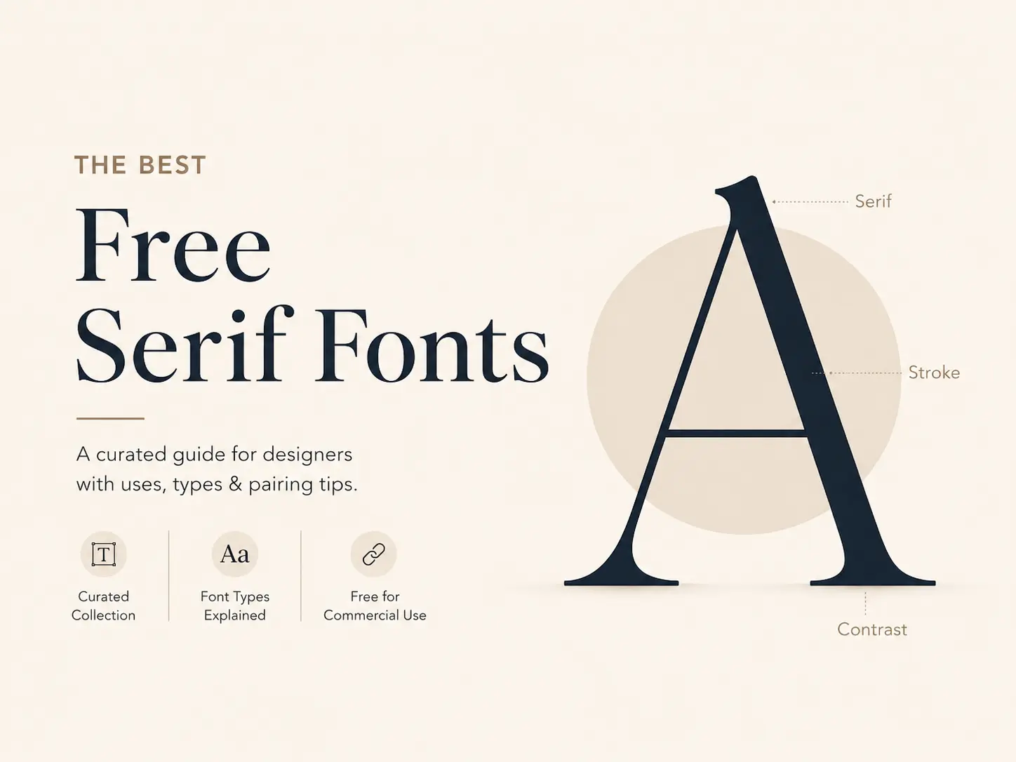
Serif fonts are defined by one specific design detail — small strokes or decorative feet that extend from the edges of each letter. Those little strokes are called serifs, and they’re what separates this entire font category from sans-serif typefaces.
But why do designers keep reaching for them?
Because they work. Serifs have been used in print for centuries because they guide the eye from one letter to the next. That same quality makes them feel authoritative, elegant, and easy to read — especially in long text. In a world that’s increasingly noisy and visual, a well-chosen serif font can make your design feel calm, credible, and intentional.
Serif vs Sans-Serif — The Simple Difference
This is the question everyone asks, and the answer is actually easy.
Serif fonts have small decorative strokes at the tips of letters. Think Times New Roman, Georgia, or any of the fonts in this guide.
Sans-serif fonts have no such strokes — clean, minimal endings. Think Helvetica, Inter, or Montserrat.
Historically, serif fonts were considered better for print, while sans-serif fonts were seen as cleaner for screens. That rule has broken down significantly. Today, several serif fonts are specifically designed for screen use — Merriweather and Lora are two good examples — and both styles are used freely across print and digital.
When Should You Use a Serif Font?
Serifs are a strong choice when:
- You want to convey trust, authority, or sophistication (finance, law, publishing, luxury branding)
- You’re setting long-form body text in print or on screen
- You need a headline that commands attention with elegance rather than aggression
- You’re designing wedding invitations, editorial layouts, book covers, or formal documents
- You want to pair a workhorse text font with a clean sans-serif — serifs and sans-serifs pair incredibly well together
Types of Serif Fonts Every Designer Should Know
Not all serif fonts look the same. Within the category, there are several distinct styles — and knowing the difference helps you pick the right one faster.
Old-Style Serifs
Old-Style serifs have roots in 15th and 16th-century typography, inspired by handwriting with a quill. They have low contrast between thick and thin strokes, a diagonal stress on curved letters, and bracketed (curved) serifs that feel warm and organic.
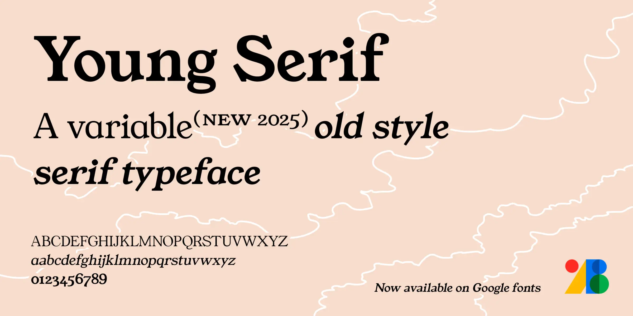
Examples in this collection: YoungSerif, Restora
YoungSerif is actually a variable old-style typeface inspired by typefaces like Plantin Infant and ITC Italian Old Style. Its rounded lowercase letters — especially the b and f — give it a soft, generous quality that old-style serifs are known for.
Transitional Serifs
Transitional serifs bridge the gap between old-style and modern. They show more contrast between thick and thin strokes, a more vertical axis, and sharper, still-bracketed serifs. They feel balanced — neither too warm nor too cold.
Examples in this collection: Merriweather
Merriweather was specifically designed for this space — reliable and screen-friendly while still carrying that classic editorial quality.
Modern / Didone Serifs
Modern serifs (also called Didones) are high-drama. They feature extreme contrast between ultra-thick verticals and razor-thin horizontals, a fully vertical axis, and unbracketed serifs. They’re bold, luxurious, and best used at large sizes.
Examples in this collection: Butler
Butler was directly inspired by the Bodoni typeface family — the original Didone — and adapted with a slightly more contemporary curve. It works best at headline sizes where that contrast really pops.
Slab Serifs
Slab serifs swap the delicate stroke contrast for heavy, block-like serifs that are as thick as the main strokes. They feel strong, modern, and direct. Often used in branding, editorial, and poster design.
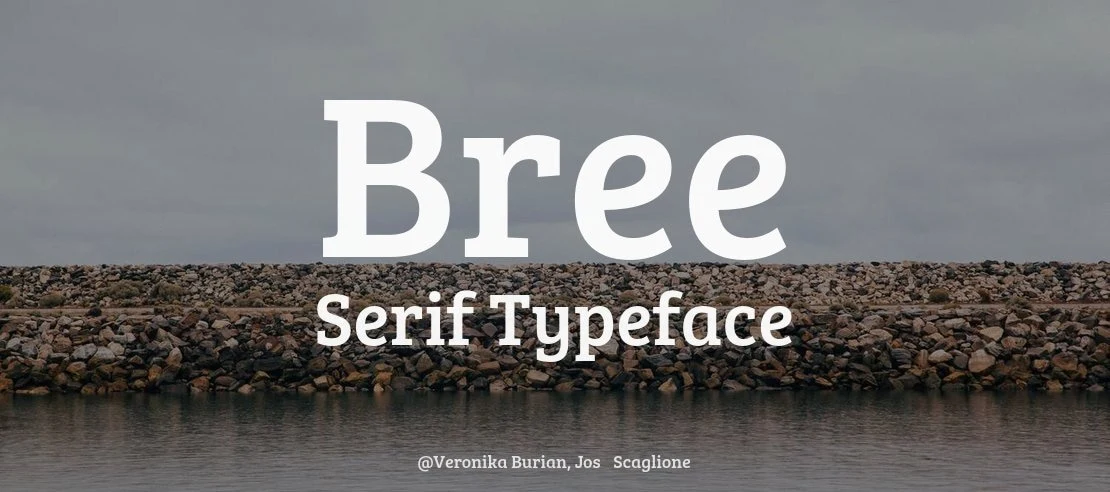
Examples in this collection: Bitter, Bree Serif, Sreda
Display & Decorative Serifs
These fonts are built for impact, not body text. They typically have distinctive, unusual characteristics — unusual proportions, retro styling, or expressive details — that make them perfect for posters, logos, and headlines where you want to make a statement.
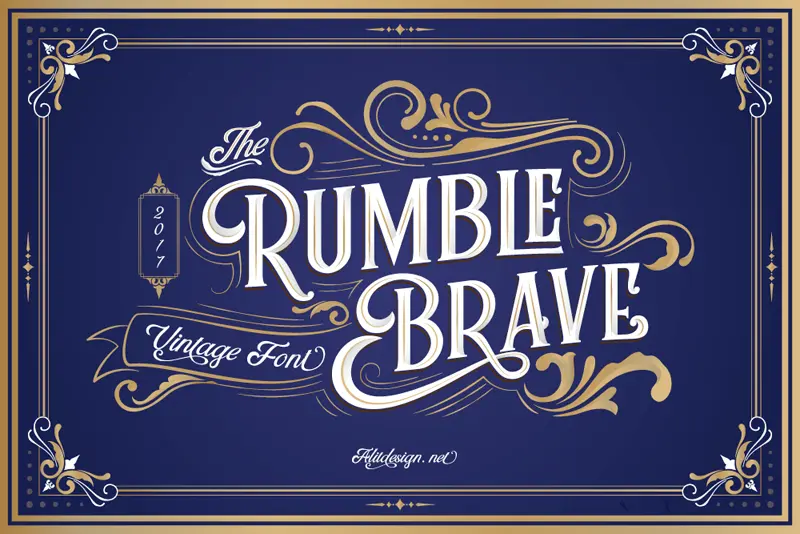
Examples in this collection: Rumble Brave, Behind The Nineties, Exodus
How to Choose the Right Serif Font for Your Project
The mistake most designers make is picking a font because they like how it looks. That’s half the decision. The other half is whether it works for the specific job it’s being asked to do.
Here’s a quick use-case guide.
For Web & Body Copy
You need a large x-height (the height of lowercase letters), open letter shapes, and low-to-moderate contrast between thick and thin strokes. High-contrast serifs get blurry and uncomfortable at body text sizes on screen. Go for: Merriweather, Lora, Bitter, Vollkorn.
For Headlines & Display
Here, contrast is your friend. You want something with personality and presence — fonts with dramatic proportions or high stroke contrast that reads beautifully at 48px and above. Go for: Butler, YoungSerif, Fénix, Arkibal Serif.
For Logo & Brand Identity
Logo fonts need to look great both large and small. They need to be distinct — something that won’t get confused with a competitor’s identity. A font with unique character shapes, stylistic alternates, or interesting proportions works well here. Go for: Exodus, Chromate, Marta, Neraphic, Calendas Plus.
For Print, Editorial & Book Design
Print rewards fonts with strong rhythm, good spacing, and deep character sets — including ligatures, small caps, and alternate figures. You also want solid language support if the design goes multilingual. Go for: Vollkorn, Lora, Grillages, Butler, Baround.
For Vintage & Retro Aesthetics
If the project calls for something that feels aged, worn, or rooted in another era — look for fonts with rough textures, uneven strokes, or styles pulled from old printing and signage. Go for: Rumble Brave, Behind The Nineties, Restora, Abraham Lincoln.
Best Free Serif Fonts for Web & Body Text
These are the workhorses. You want them to disappear into the reading experience — comfortable, clear, and consistent at any screen size.
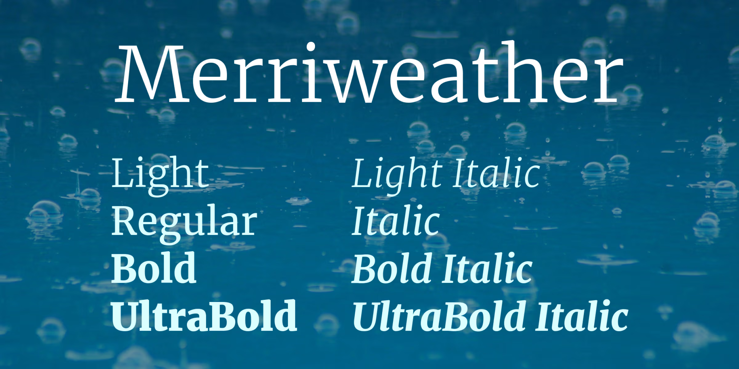
Merriweather
Designer: Eben Sorkin (Sorkin Type Co.) | License: SIL OFL — Free for commercial use | Available on: font.download
Eben Sorkin built Merriweather with a specific goal: make a serif typeface that’s actually pleasant to read on screens. He designed it with a very large x-height, slightly condensed letterforms, a mild diagonal stress, and sturdy serifs — four decisions that together make text unusually comfortable to read at standard web sizes (14–18px).
The font now comes in multiple weights from Light to Black, with matching italics across the range. There’s also a Merriweather Sans companion family that pairs seamlessly with it. It’s one of the most downloaded fonts on Google Fonts, and for good reason — it just works.
Best for: Blog body text, long-form articles, web typography, editorial websites
Lora
Designers: Olga Karpushina + Alexei Vanyashin | Foundry: Cyreal | License: SIL OFL 1.1 — Free for commercial use | Available on: Google Fonts
Lora has calligraphic DNA. Olga Karpushina designed it from a brush-pen tradition, and that shows — the curves feel drawn, not constructed. The italic variant is a particularly strong design, with letterforms that genuinely change structure when inclined (a true italic, not just a slanted version of the regular).
Despite those expressive roots, Lora is fully optimised for screen use. It supports Latin and Cyrillic scripts and was updated to a variable font in March 2019, giving you even more flexibility. It has a literary quality that works especially well for blogs, essays, and any writing-forward design project.
Best for: Literary or editorial websites, art essays, academic writing, body text with warmth
Bitter
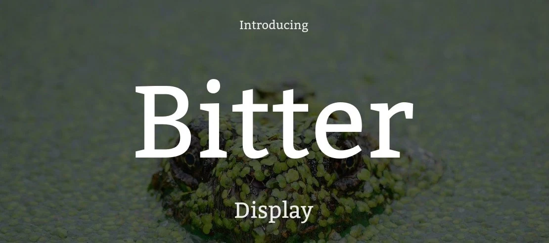
Designer: Sol Matas | Foundry: Huerta Tipográfica | License: SIL OFL 1.1 — Free for commercial use | Available on: font.download
Sol Matas describes Bitter as being born from his love for the pixel. It’s a contemporary slab serif that started from the pixel grid and then got refined into smooth, high-quality curves. The result is a typeface that handles screen rendering remarkably well — each glyph was carefully spaced by hand to minimise kerning pairs, which is especially important for web use where browser kerning support can be inconsistent.
The Regular style is deliberately heavier than a standard print Regular, generating a rich colour in paragraphs. Square-terminal serifs reinforce that strong presence. It supports Latin, Cyrillic, and Devanagari scripts.
Best for: News websites, online magazines, long-form digital reading, web apps that need strong readable text
Vollkorn
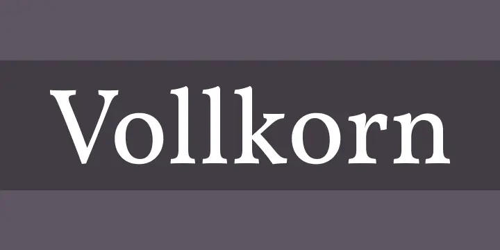
Designer: Friedrich Althausen | License: SIL OFL — Free for commercial use | Available on: fontsquirrel
Friedrich Althausen first published Vollkorn in 2005, originally under a Creative Commons licence. It’s since been fully updated to SIL OFL and now comes in 12 styles — six weights from Regular to Black, each with a matching italic.
The name means something. “Vollkorn” is German for wholemeal, referring to the old typographer’s term “Brotschrift” — literally “bread type” — which was used to describe fonts suited for everyday, practical use. That’s exactly what Vollkorn is: honest, reliable, slightly dark in colour with meaty serifs. It supports Latin, Cyrillic, and Greek scripts and includes OpenType features like old-style figures, ligatures, and contextual alternates.
Best for: Books, academic text, literary magazines, long-form print and editorial design
Afta Serif
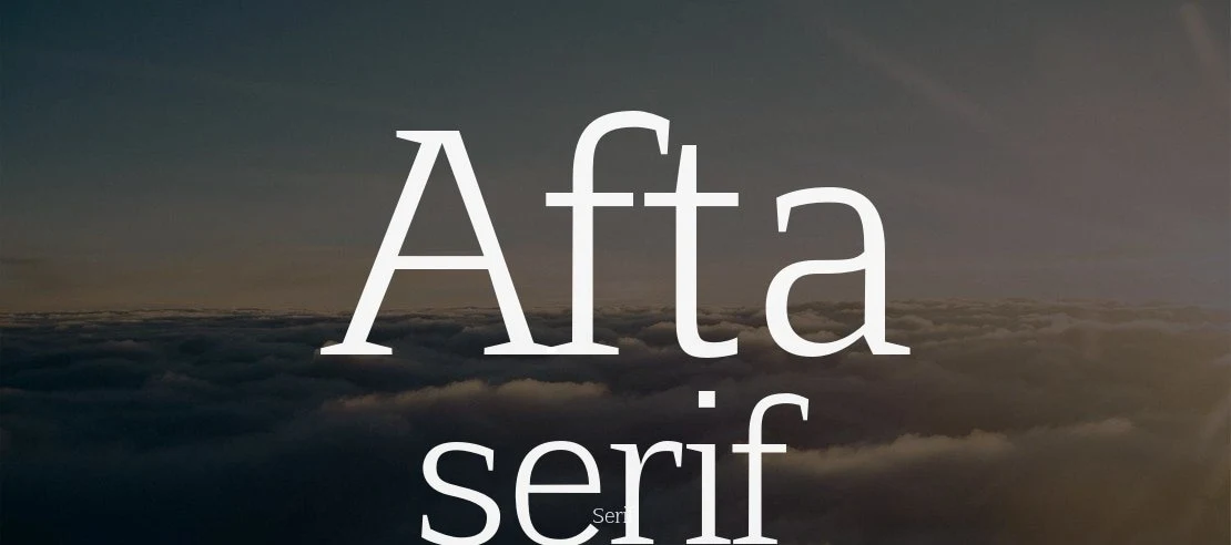
License: Free to download
Afta Serif takes a more straightforward approach — no fuss, no frills. It stays true to traditional serif proportions while staying clean enough to work as body copy on the web. It comes in regular and italic weights, covering uppercase and lowercase characters, numerals, and standard English punctuation.
Best for: Straightforward body text, document design, simple editorial projects
Best Free Serif Fonts for Headlines & Display
When a font has to command attention, you want something with presence. These fonts have personality — strong contrast, distinctive proportions, or striking details that make them work at headline sizes.
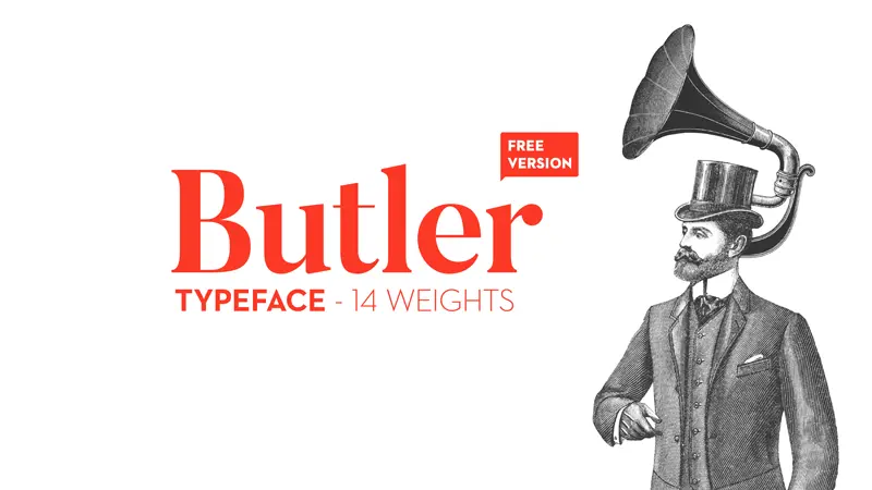
Butler
Designer: Fabian De Smet | Year: 2015 | License: Creative Commons By-Sa 4.0 — Free for personal and commercial use
Butler was designed to bring a bit of modernism to classical serif typography. Fabian De Smet took his inspiration from two sources — the precision of Bodoni and the drama of Dala Floda — and blended them into something that’s elegant yet bold.
The free family comes with 7 Regular weights (from Ultra Light to Black) and 7 Stencil weights — 14 styles in total. Each style includes 334 characters, text figures, ligatures, and fractions. Butler was awarded Font of the Month by Computer Arts Magazine, which is a good signal of its quality.
One important note: Butler’s high contrast is its strength and its limitation. It looks stunning at large sizes — posters, book covers, luxury branding, editorial titles. Below about 24px, the thin strokes get uncomfortable. Use it big.
Best for: Posters, luxury branding, editorial headlines, book cover titles, fashion and lifestyle brands
Antic Didone
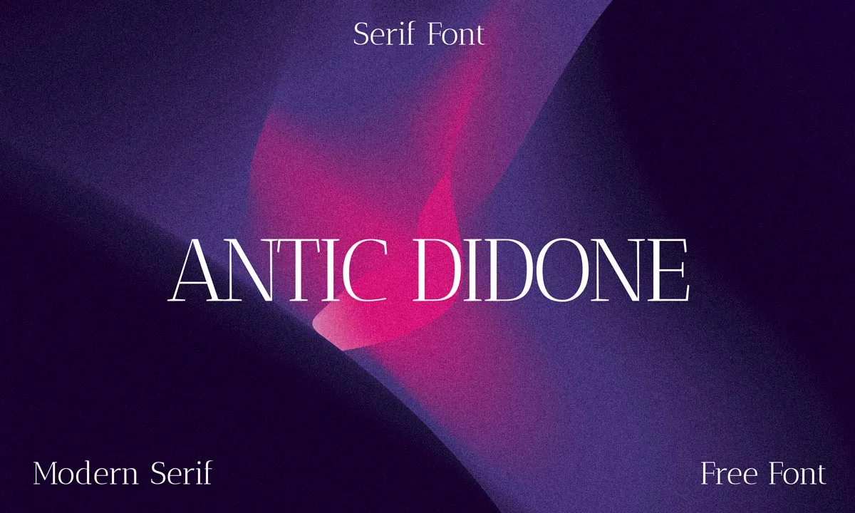
Designer: Santiago Orozco | License: SIL OFL 1.1 — Free for personal and commercial use | Available on: Resourcepik
Antic Didone belongs to the Didone family — the same tradition that gave us Bodoni and Didot. What defines this style is dramatic contrast: thick vertical strokes paired with razor-thin horizontal ones, with a fully upright axis. At display sizes, that contrast doesn’t just look elegant — it commands the room.
Santiago Orozco designed it with a modern, editorial sensibility. The letterforms are clean and precise, free of unnecessary decoration, which keeps it feeling current rather than period-piece. It supports 382 languages with Latin uppercase and lowercase characters, numerals, punctuation, and special characters like “ã” — a level of language coverage that makes it genuinely useful across international projects. The OTF format includes OpenType features with optimised kerning for both screen and print rendering.
One thing worth knowing about Didone serifs generally: they shine at large sizes. The thin strokes are a design feature, not a flaw — but below a certain size, those hairlines can get lost. Use Antic Didone for headlines, cover text, packaging callouts, and brand wordmarks where that contrast actually hits.
Best for: Luxury branding, fashion editorial headlines, cosmetic and product packaging, high-end stationery, social media graphics that need to feel premium
Liria Serif
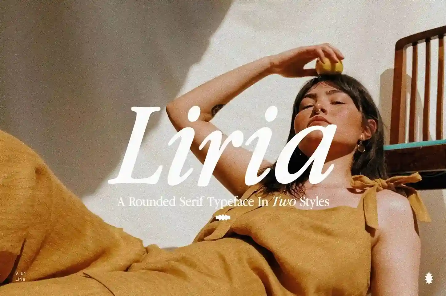
Available on: Pixelbuddha | Styles: Regular + Italic | Published: April 2025
Liria is a different kind of serif — it doesn’t try to be timeless or authoritative. Instead, it leans into a very specific feeling: the warm, slightly faded quality of a ’90s magazine spread. Think sun-bleached editorial pages, VHS box art, handwritten mixtape covers. That aesthetic is built into the letterforms themselves.
The defining quality is the soft, rounded serifs and the warm rhythm of the type. Most serif fonts project formality or precision. Liria projects cool — understated, a little laid-back, with just enough edge underneath the polish to keep it from feeling safe. Pixelbuddha describes it as a font that “knows when to whisper and when to stand out,” which is a fair read of how its Regular and Italic styles behave together.
It comes in Regular and Italic, with uppercase, lowercase, numerals, punctuation, and multilingual character support. The Italic is worth noting specifically — it carries more personality than the Regular and works well as a standalone display style for pull quotes or subheadings.
Best for: Fashion editorials, nostalgic branding, lifestyle blogs, playlist and album cover design, magazine layouts, anything that needs to feel warm and era-specific without being literally retro
Arkibal Serif
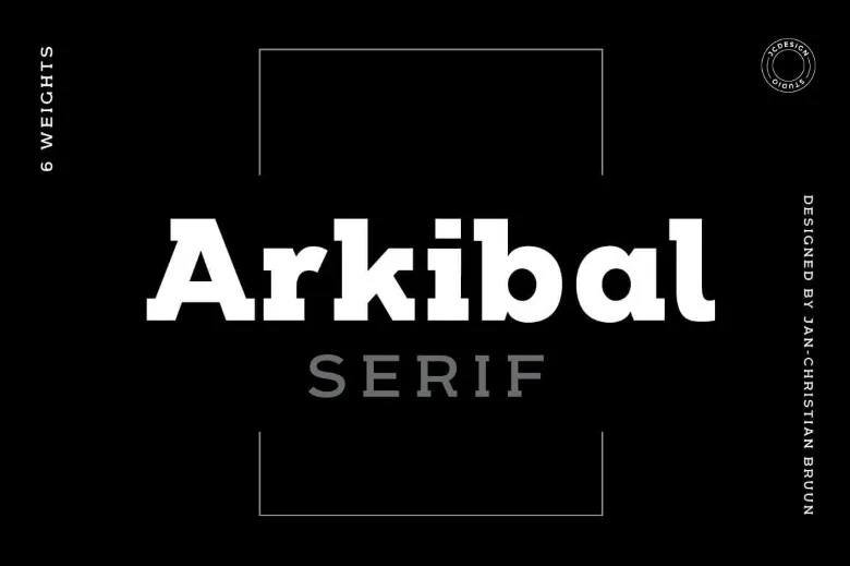
License: Available for download
Arkibal Serif takes its inspiration from vintage typography but applies it through a contemporary lens. It comes in six font weights with web font compatibility and stylistic variations — giving designers flexibility while keeping that bold, assertive character. The weight range makes it unusually versatile for a free display font.
Best for: Vintage-inspired branding, logo design, poster headlines, retro editorial
Ginder Bold
License: Available for download
Ginder is built for one purpose: making a strong visual impact. It’s a bold serif designed for headlines and titles where you need to grab the reader’s attention immediately. Its character makes it less versatile than some of the other fonts in this list, but when the project calls for impact, Ginder delivers.
Best for: Bold headlines, poster titles, attention-grabbing display type
Best Free Serif Fonts for Logo & Brand Design
Logo typography needs to do more than look pretty — it has to be distinctive, scalable, and aligned with the brand’s personality. These fonts all have unique character that helps them stand out.
Exodus
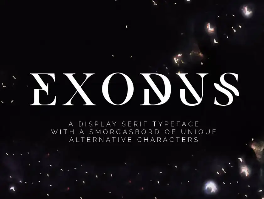
License: Free to download
Exodus carries a luxurious quality while keeping its forms clean and uncluttered. Its alternate display characters bring bold, futuristic lines to the table — giving you two personalities within one family. Depending on the weight and character variant you choose, Exodus can feel either refined or futuristic.
Best for: Premium brand identities, logo typography, poster design, product packaging
Chromate
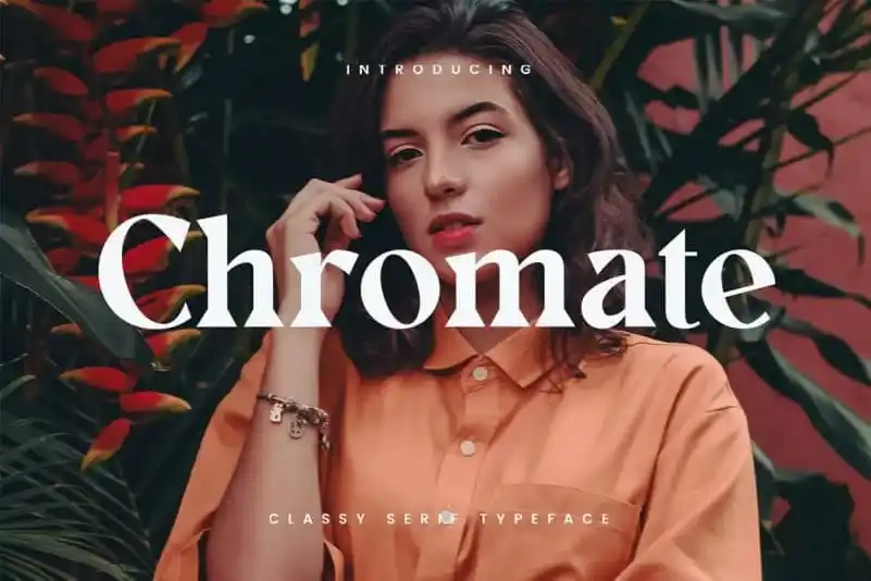
License: Free for personal and commercial use
Chromate blends modern geometric shapes with bold serifs — a combination that gives it a classy, timeless feeling rather than placing it firmly in any single era. The geometric influence keeps it clean and modern; the bold serifs give it authority. It’s cleared for both personal and commercial use.
Best for: Brand identities, logo design, premium product labels, wordmarks
Marta
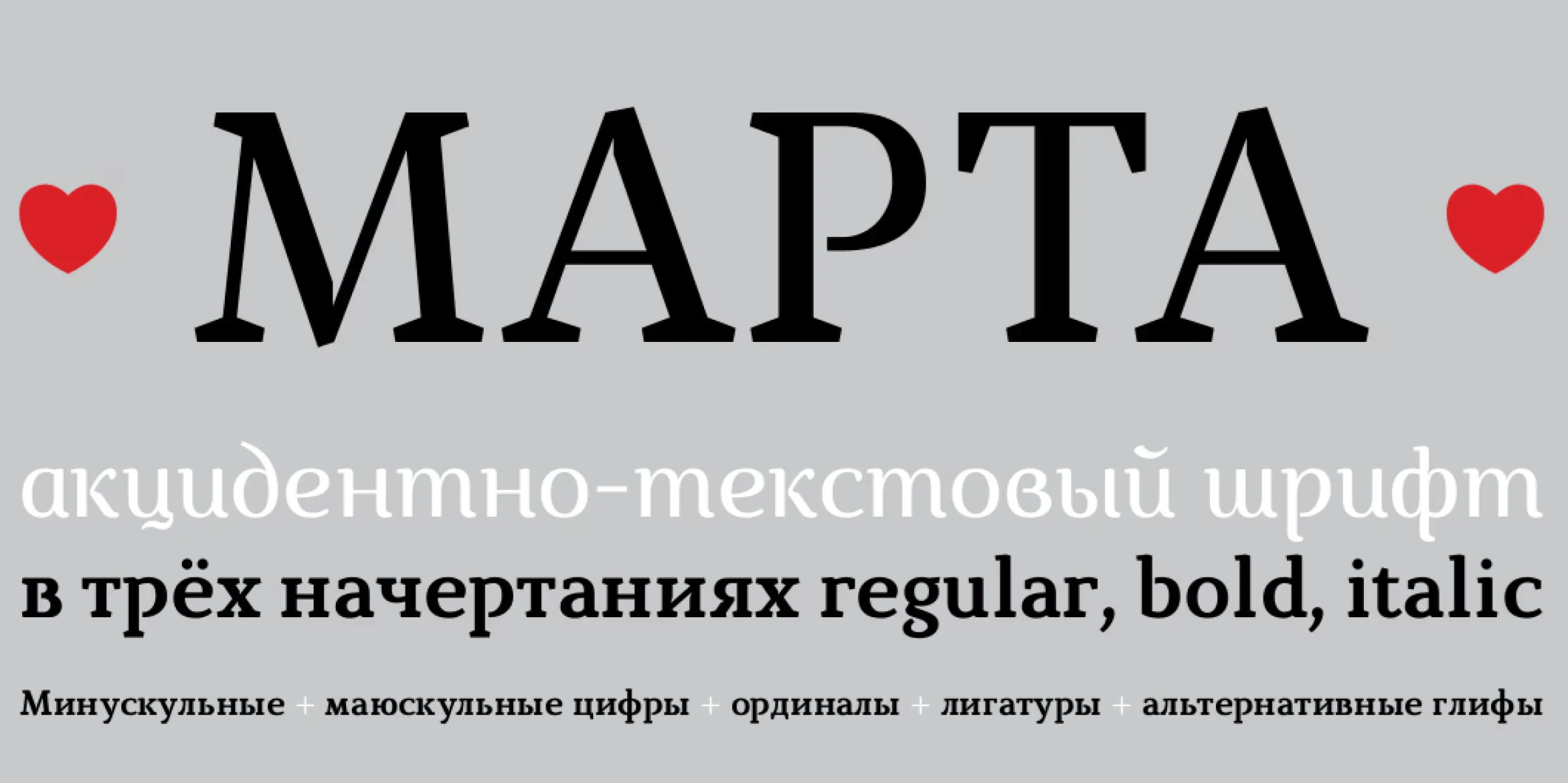
License: Free to download
Marta is a modern serif family with elegant proportions and contemporary design sensibility. It comes in regular, italic, and bold weights — a practical set for a logo family that needs to function across different contexts: full brand name, subtext, taglines. It’s particularly well-suited for branding and editorial applications where the design needs to feel current without being trendy.
Best for: Branding, editorial design, wordmarks, identity systems
Neraphic
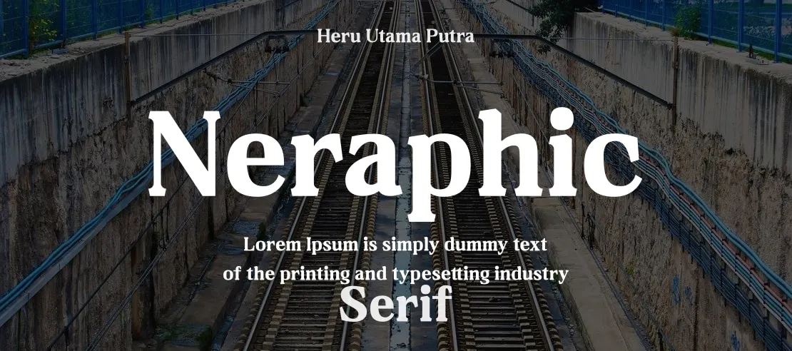
Creator: Letterena Studios | License: Personal use only (free version)
Neraphic is a modern serif built specifically with logo and title design in mind. It has bold, distinctive letterforms that make it stand out at any size. One important note: the free version of Neraphic is for personal use only. If you want to use it in client work or commercial projects, check the license from Letterena Studios before downloading.
Best for: Personal branding projects, logo explorations, bold display titles
Calendas Plus
License: Free to download (regular style)
Calendas Plus is a classic serif with a touch of real sophistication. Its proportions feel balanced and timeless — the kind of font that makes a brand feel established rather than new. The regular style is free to download. It’s flexible enough to work across a range of project types, from book covers to stationery to brand identities.
Best for: Classic brand identities, luxury stationery, publishing, premium packaging
Best Free Serif Fonts for Vintage & Retro Projects
Some projects live in a specific era. Whether you’re designing for a craft brand, a heritage product, a hand-printed poster, or a venue with a history — these fonts bring that aged, analogue quality that no amount of clean modernism can replicate.
Restora
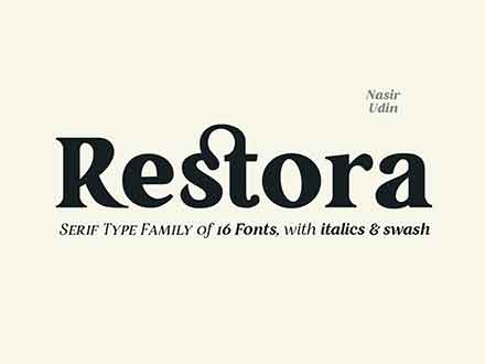
Designer: Nasir Udin | License: Free for personal use (paid for commercial)
Restora is an old-style roman serif built for exactly this space. The full family spans 8 weights from Thin to Black with matching italics, and each style includes more than 730 glyphs with OpenType features like swash characters, stylistic alternates, small caps, and both standard and discretionary ligatures.
The free version includes Restora Extra Light and Restora Thin Italic. If you need the full family for client work, you’ll need the paid commercial license.
Best for: Book layouts, vintage branding, formal invitations, high-end editorial, heritage brand identities
Abraham Lincoln Serif
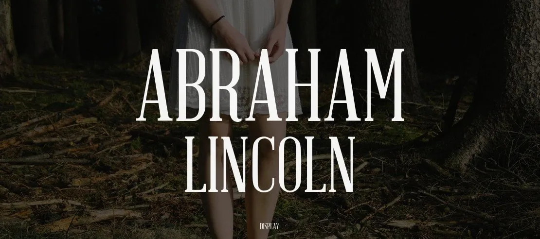
License: Free to download
The Abraham Lincoln Serif font takes its design cues from its unusual inspiration: the actual president’s height, stature, and character. That translates into a condensed, upright serif that’s confident and readable. The condensed design makes it efficient at headlines while giving it a slightly historic quality.
Best for: Period-piece designs, editorial headlines, retro poster projects, condensed headline applications
Best Free Serif Fonts for Editorial & Print
Print typography rewards fonts with strong rhythm, careful spacing, and deep character sets. These fonts are built for sustained reading across multiple pages.
Grillages
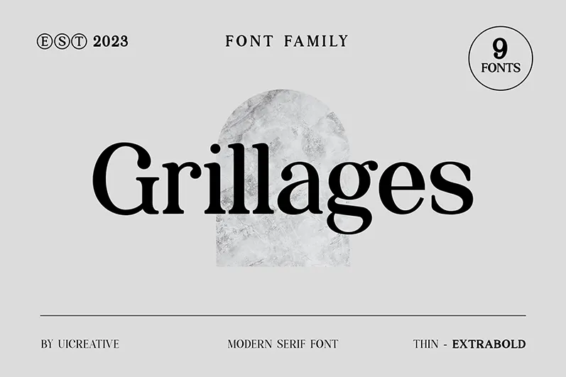
License: Available for download
Grillages balances contemporary design sensibility with classic serif characteristics — a combination that makes it especially suited for editorial work. Its readability holds at small sizes while its structure gives it a modern, designed quality at display sizes.
Best for: Editorial layouts, magazine design, branding, print publications
Knubi
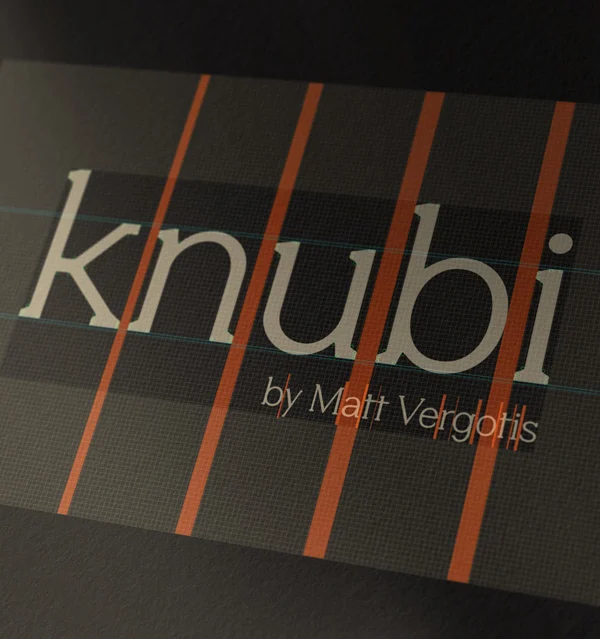
Designer: Matt Vergotis | Glyphs: 380+ | Language support: 80 languages | License: Personal use only (free version)
Knubi is an interesting addition to the category — a friendly serif with beautifully rounded swashes that give it a distinctive, warm quality. The deep character set (380+ glyphs) and support for 80 languages make it a capable font for international editorial work. Note: the free version is personal use only.
Best for: Editorial design, multilingual print projects, friendly brand typography
Romancio
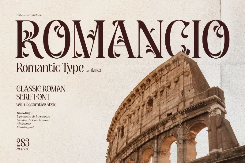
License: Free to download
Romancio is more expressive than most of the other fonts in this collection. It has a romantic, script-like appearance that gives it a flowing quality — making it stand out immediately in the right context. It works for wedding stationery and formal invitations, but also for any design that needs to feel genuinely elegant rather than just formally correct.
Best for: Wedding invitations, romantic branding, luxury stationery, expressive posters
Sreda
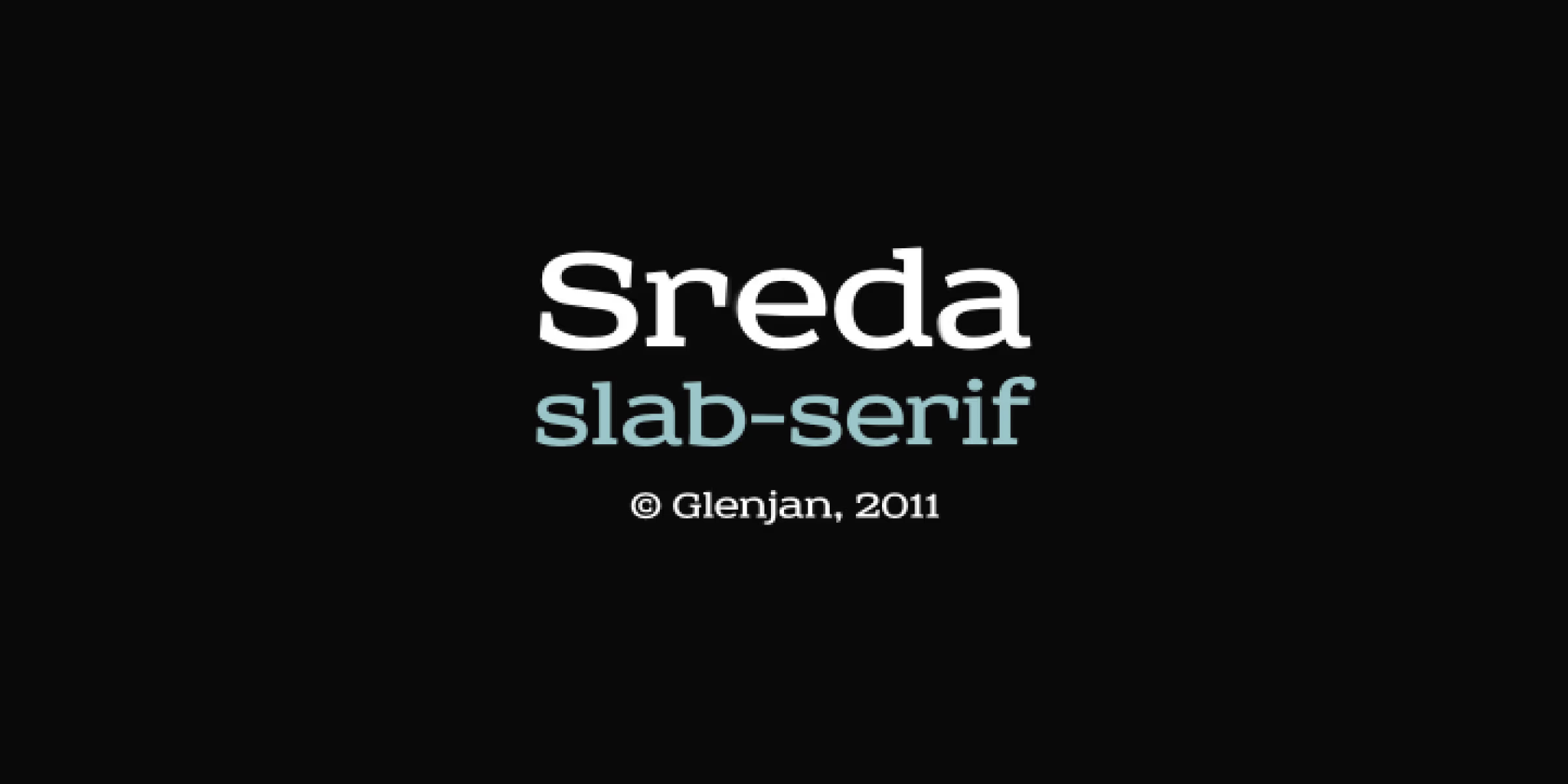
License: Free to download
Sreda is a modern slab serif with clean lines and a balanced, considered design. It sits in an interesting middle space — contemporary enough to feel current, but not so distinctive that it overwhelms the content. That balance makes it adaptable across editorial, branding, web, and print.
Best for: Editorial design, branding, web design, versatile print projects
Serif Font Pairing Ideas That Actually Work
Typography pairing is one of the most practical skills you can develop as a designer. The good news is that serif fonts pair well with a wide range of other styles — and the rules are simpler than most people make them sound.
Serif + Sans-Serif Combinations
This is the most reliable pairing pattern in typography. The contrast between the two styles — the structured warmth of a serif body and the clean precision of a sans-serif heading (or vice versa) — creates a natural visual hierarchy.
Strong pairings from this list:
- Merriweather (body) + Montserrat or Inter (headings)
- Lora (body) + Raleway or Josefin Sans (headings)
- Butler (headings) + Futura or DM Sans (body)
- Vollkorn (body) + Source Sans Pro (UI elements and captions)
The general rule: use the serif for whichever role needs more warmth or authority, and the sans-serif for the elements that need clarity and efficiency.
Serif + Script Pairings
Serif + script pairings are especially useful for wedding stationery, premium branding, invitations, and any design that needs to feel considered and hand-crafted.
- Calendas Plus + a clean brush script
- Romancio works as a script-adjacent display font that can be paired with a clean serif body like Lora or Vollkorn
- Butler + a modern calligraphy script creates a high/low contrast that feels editorial and sophisticated
Two-Serif Pairings
Pairing two serifs is harder — and should only be done when there’s strong contrast between the two in weight, size, or style. A heavy display serif (Butler at 72pt) and a quiet text serif (Merriweather at 16pt) can work together because the contrast is sufficient. Avoid pairing two serifs that are similar in weight and personality — they’ll compete rather than complement.
Free Font Licenses Explained — Personal vs Commercial Use
Before you use any font in a client project or a product that generates revenue, you need to check the license. This isn’t optional, and it’s easier to understand than most designers think.
What Does “Free for Personal Use” Mean?
A font marked “free for personal use” cannot be used in:
- Client work of any kind
- Commercial products (apps, merchandise, products for sale)
- Marketing materials for a business
- Anything that generates revenue or is commissioned by someone else
It’s specifically meant for your own personal, non-commercial projects — like a personal art print or a private blog.
What Is the SIL Open Font License (OFL)?
SIL Global created the SIL Open Font License (OFL). It’s the most common free font license in the design world and it’s clear in what it allows:
- Allowed: Use in any project, personal or commercial. Embed in websites, apps, PDFs, documents. Modify the font for your own use. Redistribute as part of a design package.
- Not allowed: Sell the font files by themselves as a standalone product.
If a font is under SIL OFL, you can use it in client work, commercial products, websites, logos, printed materials, and apps — all without paying a license fee or providing attribution.
Which Fonts in This List Are Safe for Client Work?
Yes, free for commercial use (SIL OFL or equivalent): Merriweather, Lora, Bitter, Bree Serif, Vollkorn, YoungSerif, Fénix, Butler (CC By-Sa 4.0), Chromate, Baround, Romancio, Sreda, Abraham Lincoln, Calendas Plus (regular style), Afta Serif, Tryst
Personal use only (check before using in client projects): Knubi, Neraphic, Restora (free version)
When in doubt, click through to the original download page and read the license file included in the font package. Every reputable font release includes one.
Frequently Asked Questions About Free Serif Fonts
What is the best free serif font for body text on a website?
Merriweather is the most widely recommended choice for web body text — it was specifically designed for screen reading, with a large x-height and sturdy serifs that hold up at standard paragraph sizes. Lora is a close second if you want something with a slightly warmer, more literary feel.
Are Google Fonts serif fonts free for commercial use?
Yes. All fonts available on Google Fonts — including Merriweather, Lora, Bitter, Bree Serif, Vollkorn, and Fénix — are licensed under the SIL Open Font License (OFL). That means they’re free for commercial use in websites, apps, logos, and print materials.
What is the difference between a serif and a slab serif font?
A traditional serif has contrast between thick and thin strokes, with bracketed (curved) serifs that taper. A slab serif has serifs that are thick, square blocks — as heavy as the main strokes themselves — with little or no stroke contrast. Bitter and Bree Serif in this list are slab serifs. Merriweather and Lora are traditional (transitional) serifs.
Which free serif font is best for logo design?
For logos, look for fonts with distinctive character — something that won’t look generic. Exodus, Butler, Chromate, and Calendas Plus are all strong choices. Check that the font is licensed for commercial use before finalising any client logo.
Can I use free serif fonts in printed materials like brochures or business cards?
Yes, as long as the font is under a license that permits commercial use. SIL OFL fonts — which covers most fonts in this list — allow use in all printed materials. Always check the specific license of the font you’re using.
What is the most elegant free serif font?
“Elegant” is subjective, but Butler, Lora, and Calendas Plus consistently get mentioned in this context. Butler has the high-drama, high-contrast elegance of a luxury magazine. Lora has a quieter, literary elegance rooted in calligraphy. Calendas Plus feels timeless and balanced.
Which free serif font works best for a book layout?
Vollkorn is built for this. Friedrich Althausen designed it specifically for “bread and butter use” — everyday, sustained reading — and it includes the OpenType features (old-style figures, ligatures, small caps) that make professional book typography possible. Lora and Butler also work well for book design.
Final Thoughts
There’s a serif font on this list for every kind of project — from screen-first blog body text to high-contrast luxury display type. The key is matching the font to the specific job: the platform, the audience, the feeling you want to create, and the license terms that match your use case.
Start with Merriweather or Lora if you’re building for the web. Go to Butler or YoungSerif if headlines are your priority. Reach for Vollkorn or Restora when the project lives in print.
Download a few, test them at actual usage sizes (not just the preview), and see which one earns its place in your project. Good typography isn’t about the most beautiful font — it’s about the right font doing its job without drawing attention to itself.