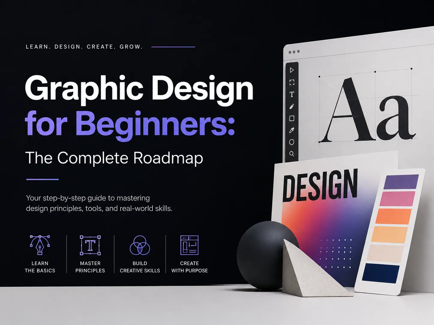
If you are reading this right now, you are probably in one of two places. Either you just discovered a love for design and have no idea where to start, or you have been “learning” for a few months, but your designs still look off, and you cannot figure out why.
I have been there. When I first got into graphic design, I was excited but completely lost. I would open a project, stare at a blank canvas, and make all the classic beginner moves — random fonts, clashing colors, and elements scattered across the slide with no logic behind them. I remember the first sports-related design I tried to create. I had no idea which fonts carried energy, which textures felt athletic, or how to make the whole thing feel like it belonged to a brand. It looked like a birthday poster for a football match.
What nobody tells you upfront is that graphic design is not about being naturally artistic. It is a skill built on a set of learnable principles. Once you understand those principles, everything — the colour decisions, the font choices, the layout — starts to make sense.
This is the guide I wish I had found on day one.
What Is Graphic Design? (And Why It Is the Most Underrated Skill Right Now)
Graphic design is visual communication. It is the practice of using typography, colour, images, and layout to convey a message, build trust, and drive action. Every time you stop scrolling on an Instagram post, click a button on a website, or feel drawn to a brand — design made that happen.
In 2026, graphic design is no longer just a creative career. It is a core business skill. Content creators need it. Entrepreneurs need it. Marketers need it. And with AI tools lowering the technical barrier, the real competitive edge has shifted to design thinking — understanding why a design works, not just how to make it.
Career paths that start with graphic design basics:
- Social media designer and content creator
- Brand identity designer
- UI/UX designer
- Motion graphics designer
- Freelance visual marketing consultant
You do not have to pick a path on day one. But knowing these options exist helps you design with purpose from the beginning.
7 Fundamental Principles Every Beginner Must Know
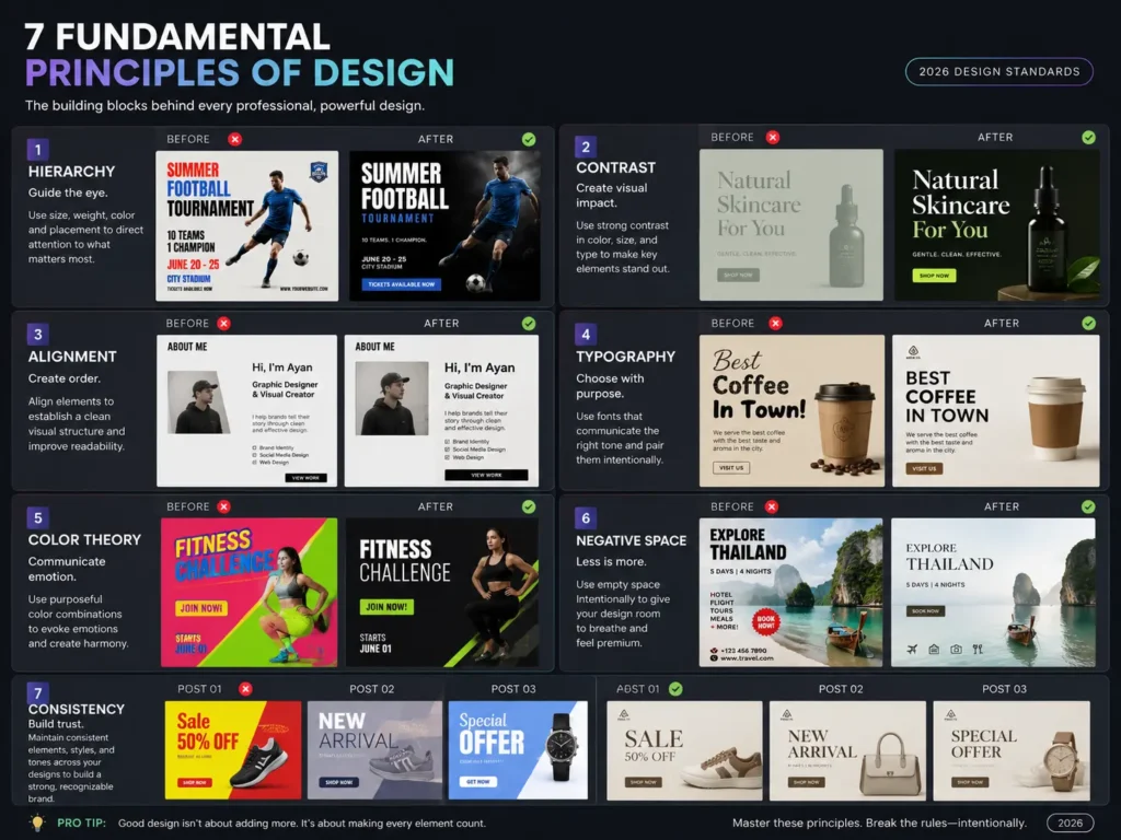
Before you open any design software, you need to understand how design actually works. Every professional design — no matter how simple or complex — is built on these principles. Skip them, and your work will always look slightly off, no matter how good your tools are.
1. Hierarchy: The Showroom Manager
Hierarchy is the absolute anchor of any effective design. If a design fails, 99% of the time, it is a hierarchy problem.
Here is the best way to think about it. Imagine walking into a high-end luxury crockery showroom. If every single plate, vase, and spoon has a massive spotlight on it, the store feels cheap and overwhelming. A truly premium store has one stunning centrepiece in the main window. Once you walk in, a smaller sign directs you to the collections. Then the tiny price tags give you the fine details.
Design works the same way. You are the showroom manager. Your job is to force the viewer’s eye through the design in the exact order you want:
- The Hook — the scroll-stopping headline or image that grabs attention first
- The Bridge — the subtext that gives context and keeps them reading
- The Action — the CTA, logo, or detail they should see last
A quick test: squint your eyes and look at your design. If you cannot instantly tell what the most important element is, your hierarchy is broken.
2. Contrast: The Progressive Overload
Most beginners think contrast means white text on a black background. That is only about 10% of what contrast actually does.
Think about how muscles grow in the gym. If you lift the same weight, at the same tempo, for the same reps every day, nothing happens. Growth requires progressive overload — a sharp, disruptive change in resistance. Design works the same way. If all your fonts are the same medium weight and all your elements are the same medium size, the design is flat and weak.
True contrast is about extreme tension. Pair a massive, heavy, brutalist font directly next to a delicate, ultra-thin serif. Put a tiny, perfectly isolated element inside a huge sea of empty space. Stop tweaking things by 10%. If you want something to be bigger, make it 300% bigger.
3. Alignment: The Invisible Skeleton
Amateur work always feels slightly wobbly or disorganised, even when the fonts and colors are fine. This is almost always an alignment issue.
Think about a high-end cosmetic clinic. Why does the space feel premium and trustworthy before the doctor even says a word? Because everything — the chairs, the instruments, the signage — is perfectly aligned, clean, and intentional. Alignment is the invisible skeleton that holds your design together and signals professional precision.
One thing beginners get wrong: they centre-align everything because it feels safe. Centre alignment is actually the hardest to read because the starting edge of every line keeps changing, forcing the eye to jump around. Strong left alignment creates a solid invisible axis that the eye can slide down effortlessly.
4. Color Theory: More Than Just Pretty Colors
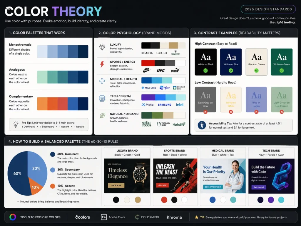
Colour carries psychological weight. Every colour communicates something before a single word is read. Dark navy signals authority and trust. Warm reds create urgency and energy. Soft creams and neutrals feel premium and calm.
For beginners, the most important thing to understand is colour contrast for readability. If you use a dark background, use light text on top of it. If your background is light, go dark with the text. There are free tools like Coolors and Adobe Color that let you test contrast ratios and find harmonious palettes. Use them.
A simple rule: limit yourself to three colors in any design — a dominant, a secondary, and an accent. More than three and the design starts pulling in every direction.
5. Typography: Fonts Have Feelings
Every font carries a personality. A heavy, sharp display font screams energy and aggression — perfect for a sports brand. An elegant, thin serif feels refined and premium — right for a luxury clinic or a fashion label. A clean sans-serif communicates clarity and modernity — ideal for tech companies and corporate brands.
As a beginner, never use more than two fonts in a single design. One for headlines, one for body text. Make sure they create contrast — pair a display or serif headline font with a clean, readable sans-serif for the supporting copy.
6. Negative Space: The Breath
Beginners are terrified of empty space. They treat blank areas as something that needs to be filled — another logo, a pattern, more text. This is the fastest way to make a design look cheap.
Think about a social media carousel. If every single slide is packed wall-to-wall with text and images, the viewer suffocates and scrolls away. Negative space is the breath between the sentences.
Space is not empty — it is an active design element. By giving your main elements room to breathe, you dramatically increase their perceived value. Cheap brands fill every pixel. Premium brands give their subject space.
7. Consistency: The Brand System
A single good design is not a brand. A brand is what happens when your colors, fonts, spacing, and visual tone are consistent across every piece of content you create. Consistency is what makes a brand feel professional and trustworthy over time.
Build a simple style guide early — even just a document with your chosen fonts, hex codes, and spacing rules. This applies to your own personal brand as much as it applies to any client work.
Best Free Tools for Beginners in 2026 (Honest Comparison)
Before we talk about tools, let me say something important that most design blogs will never tell you.
The tool is not the talent.
I have seen designers create genuinely stunning, professional work inside Canva. I have seen designers produce embarrassing work on Photoshop — a tool that costs money and takes months to learn. Your design sense, your understanding of hierarchy, your eye for colour — those are your real tools. The software is just the brush.
That said, choosing the right starting point matters. Here is an honest, beginner-focused breakdown:
| Tool | Best For | Cost | Learning Curve | When to Start |
|---|---|---|---|---|
| Canva | Social media, presentations, and quick brand assets | Free (Pro available) | Very low | Day 1 |
| Adobe Express | Quick branded content, basic editing | Free tier available | Low | Day 1 |
| Figma | UI/UX design, web layouts, app interfaces | Free for individuals | Medium | Month 2–3 |
| Adobe Photoshop | Photo editing, compositing, and advanced graphics | Paid ($$$) | High | Month 3+ |
| Adobe Illustrator | Logo design, vector illustrations | Paid ($$$) | High | Month 3+ |
| GIMP | Photo editing (free Photoshop alternative) | Free | Medium | Month 2 |
| Inkscape | Vector design (free Illustrator alternative) | Free | Medium | Month 2 |
The honest recommendation: Start with Canva or Adobe Express. Master the principles — hierarchy, contrast, alignment, colour — inside a tool that does not fight you. Once your design thinking is solid, graduate to Figma (for UI/UX) or Adobe tools (for everything else).
Do not let anyone make you feel less serious for using Canva. The design lives in your mind. The tool is just where you execute it.
AI Tools That Make Learning Faster (And Your Work Look More Professional)
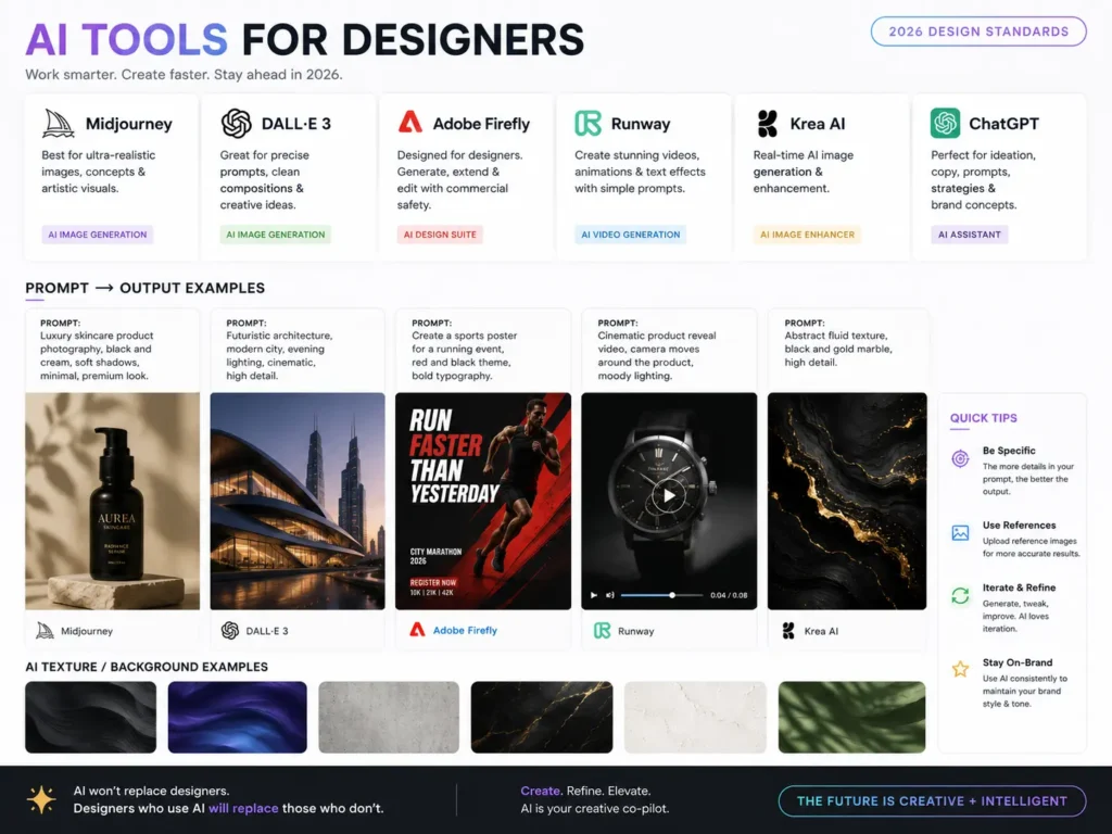
In 2026, AI is not replacing designers. It is eliminating the most time-consuming, frustrating parts of the early process — so you can spend more time on the thinking that actually matters.
Here is how to use AI practically as a beginner:
Setting Brand Direction
Say your client runs a sports car dealership and they need a brand identity. Where do you even start? Instead of spending hours on Pinterest trying to find a direction, open ChatGPT, Claude, or Gemini and explain the brief in full. Tell it the industry, the target audience, the tone, and the feeling the brand needs to create.
The AI will suggest specific font styles (in this case, probably a bold display or compressed sans-serif for energy), a colour palette rationale (black, red, and metallic tones for performance and power), and which types of visual elements and textures reinforce the brand tone.
This does not replace your design judgment — it gives you a structured starting point instead of a blank canvas.
Generating Custom Textures and Backgrounds
Need a specific texture that does not exist in any stock library? Prompt an image generation tool like Google Gemini, ChatGPT’s image generation, or Midjourney with a detailed description. “A subtle, high-resolution carbon fibre texture in dark gunmetal grey with a slight sheen” will get you exactly what you need in under a minute.
Creating Placeholder Models for Designs
Designing a skincare brand post and need a model, but have no photography budget? Prompt an AI image generator with the exact shot you need — lighting style, skin tone, pose, clothing. The output gives you a professional-looking placeholder (or final asset) that makes the design look complete and helps the client visualise the concept.
Font and Color Pair Suggestions
Not sure which fonts go together for a specific brand tone? Ask an AI. “Suggest two Google Fonts that would pair well for a luxury B2B travel brand targeting corporate executives.” You will get a specific, reasoned answer in seconds.
AI does not give you taste. You still have to look at the suggestions and decide what actually works. But it collapses hours of research into minutes.
Your 6-Month Learning Roadmap
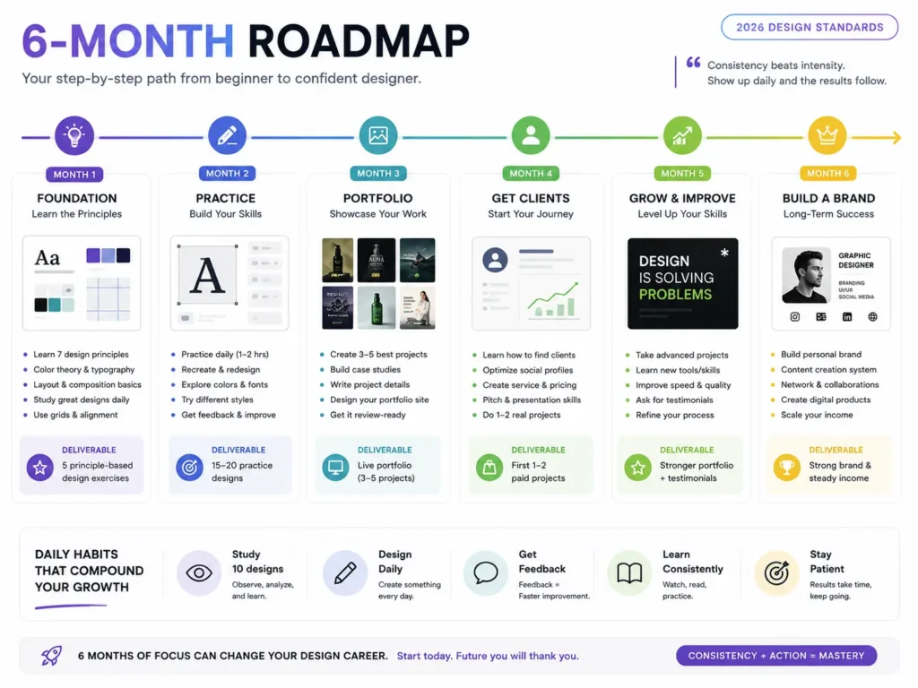
This is the one thing no other beginner guide gives you — a structured path instead of a scattered list of tips.
Month 1: Build Your Foundation
Before you touch software, build your eye.
Week 1–2: Learn the principles. Study hierarchy, contrast, alignment, colour theory, and typography. Read this article. Watch free YouTube videos from channels like Flux Academy and The Futur. Do not open design software yet.
Week 3–4: Train your visual judgment. Open Pinterest and search for designs in a niche you find interesting. Do not just scroll — study. When one design stops you in a feed full of similar designs, ask yourself: why does this one work? What is the hierarchy doing? Where does the eye go first? How much negative space is there? What fonts are they using and why?
This daily practice of observing and analysing good design is the single fastest way to build an aesthetic sense. No course accelerates your eye faster than this.
Month 1 goal: Be able to look at any design and articulate why it works or does not work.
Month 2: Start Creating (Imperfect Reps)
Now open the tool. Start with Canva or Adobe Express.
Create dummy designs. Redesign existing social media posts you found on Pinterest — not to copy them, but to understand the decisions behind them. Change the hierarchy. Swap the fonts. Adjust the colour palette. See what breaks and what improves.
At this stage, use AI tools to help you set the brand direction before you design. Get comfortable prompting for colour palettes, font suggestions, and layout ideas.
Month 2 goal: Complete 20 designs. They do not need to be perfect. Reps build muscle memory.
Month 3: Niche Down and Go Deep
Pick one or two design niches that interest you — social media content, brand identity, presentation design, or UI. Go deep on those specifically.
Start the three beginner projects listed later in this article. Treat them as real client jobs. Build full case studies.
At this point, if you can find any senior designer to observe or collaborate with — even informally — do it. Seeing a professional’s thought process and workflow in real time compresses months of learning.
Month 3 goal: Have three strong, case-study-quality pieces for your portfolio.
Months 4–6: Build in Public and Start Pitching
Post your work. Document your process. Share the thinking behind your designs, not just the finished files. This builds your audience and your credibility at the same time.
Begin reaching out to potential clients using the methods in the portfolio and client sections below. Your first paying project will teach you more than six months of tutorials.
5 Beginner Projects to Build Your Skills
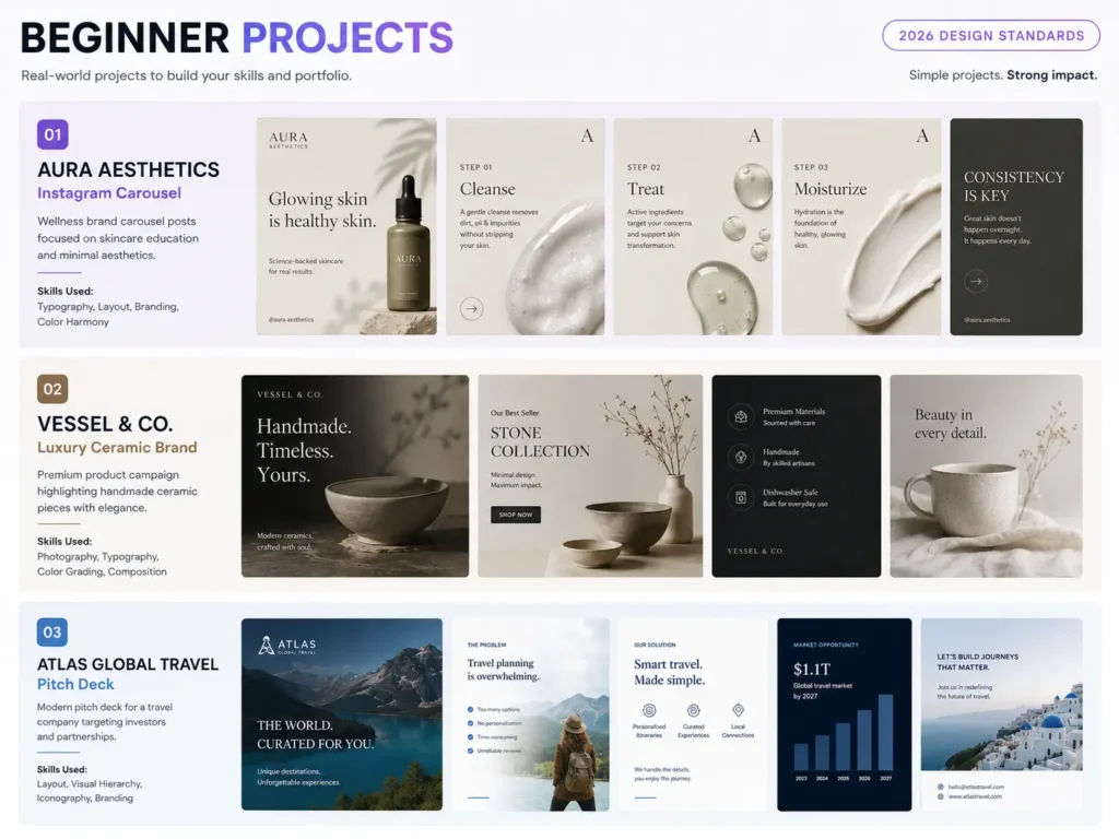
Here is what every other article gets wrong: they tell you to “practice every day”, but never give you anything specific to practice with. These are three real briefs you can start today.
Project 1: The Trust-Builder — Aura Aesthetics
The brief: Design a 4-slide educational Instagram carousel for a premium cosmetic surgery clinic called Aura Aesthetics. The goal is to educate potential patients on the difference between Botox and Dermal Fillers while alleviating anxiety and positioning the clinic as a trusted, premium provider.
Target audience: Men and women aged 30–50, with high disposable income, interested in cosmetic procedures but nervous about the process.
What this teaches: Strategic hierarchy (how to write and format a scroll-stopping Slide 1 hook, build momentum through Slides 2–3, and close with a high-converting CTA on Slide 4), plus typography discipline for medical authority.
What success looks like: The finished carousel must look clean and clinical. Use a muted, high-end colour palette — cream, slate, or deep emerald. No neon. Massive padding around all text. When you squint at Slide 1, the hook text must dominate the frame entirely.
Project 2: The Attention-Grabber — Vessel & Co
The brief: Design a set of 3 coordinated social media ad templates (square 1:1, stories 9:16, and portrait 4:5) for a luxury minimal ceramic tableware brand called Vessel & Co, announcing a new limited-edition collection launch.
Target audience: Modern homeowners and interior design enthusiasts aged 25–45 who value aesthetics and are willing to pay premium prices.
What this teaches: Advanced product isolation and contrast (making the product the absolute hero of the frame), and multi-format layout systems (scaling one concept cleanly across three different aspect ratios without just stretching things).
What success looks like: The finished assets should look like they belong in an elite design magazine. Solid or textured muted background, aggressive typographic contrast — a large display font headline paired with tiny, perfectly letter-spaced metadata like the launch date and website.
Project 3: The Authority-Builder — Atlas Global Travel
The brief: Design a 5-slide pitch deck framework for an international B2B travel wholesaler named Atlas Global Travel, used to pitch large travel agencies on bulk booking partnerships.
Target audience: Corporate executives and agency owners who read fast, hate fluff, and make decisions based on data and trust.
What this teaches: Data layout and clean alignment (organising text and numbers into scannable visual structures), and strict grid systems (keeping the layout consistent from slide to slide).
What success looks like: Zero bullet-point lists. All information is broken into clean, left-aligned columns or 3-part grid blocks. Deep navy with a sharp accent — electric blue or muted gold. When you flip through the slides quickly, the layout should feel rock-solid. Elements should not jump or shift between pages.
How to Build a Portfolio With Zero Client Work
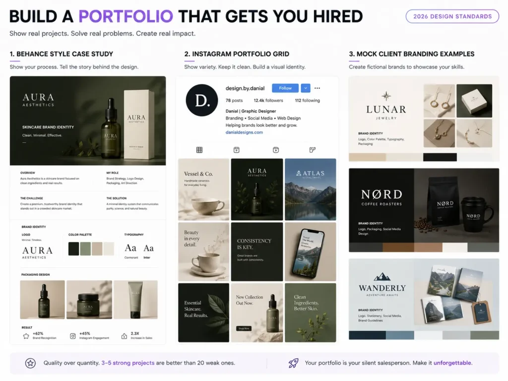
This is the most googled question among new designers — and the most poorly answered. Every article says “build a portfolio.” None of them tell you what to put in it when you have never had a paying client.
Here are five methods that actually work.
The Reverse Pitch
Find local businesses or professionals who are making money but have weak or outdated visual branding. A local cosmetic surgeon, a luxury lifestyle store, a B2B wholesaler. Redesign their branding — create 3–4 high-quality social media carousels, a refined logo concept, or a landing page mockup.
Then send it to them, unprompted, with this message: “I noticed your clinic is doing great work, but your social media visuals do not reflect the premium service you offer. I made these for you — completely free to use. If you like them, let us talk about working together.“
Even if they say no, you now have a real-world, industry-specific case study. If they say yes, you have your first client.
Hyper-Niche Conceptual Projects
Nobody is hiring you because you designed a logo for a generic coffee shop. Clients hire designers who understand how design drives business.
Build 2–3 deeply thought-out conceptual projects for specific, high-paying niches. Do not just make a logo — build the entire ecosystem. If you choose a B2B wholesaler, design the pitch deck, the LinkedIn carousel templates, and the email newsletter headers together. Then present the whole thing as a case study: explain the problem, the strategy, and how your specific design choices solved it.
Build in Public (The Social Media Portfolio)
Your Instagram or LinkedIn feed can be your active portfolio — but only if you position it correctly. Stop posting just the finished design. Post the process and the psychology behind it.
Create carousels that break down your design decisions. Explain why a specific layout increases engagement, or how you built a brand’s visual identity from scratch. This positions you as a strategic consultant, not just someone who makes things look nice. Clients hire the designer who can explain how their work creates results.
Digital Asset Library
Build high-quality free design assets — social media templates, UI kits, texture packs, typography layouts — and distribute them through a personal landing page or a platform like Gumroad. When other creatives or business owners download and use your assets, they experience your skill level directly. A well-designed free resource is a portfolio piece that works for you 24 hours a day.
Barter With Complementary Freelancers
Network with freelance copywriters, digital marketers, or video editors who are also growing their businesses. Offer to handle their personal branding — social media posts, YouTube thumbnails, website assets — in exchange for testimonials or warm client referrals. Marketers and editors are always talking to business owners. Once they trust your work because you have elevated their own brand, they will pass your name along without hesitation.
10 Mistakes Beginners Make (and How to Avoid Them)
1. Designing for aesthetics instead of business objectives
Beginners want to make art. Professionals want to solve problems. A beautiful design that does not align with the brand’s marketing strategy and target audience is worthless to a client. Before you design anything, ask: what is this design supposed to make the viewer feel or do?
2. Failing to build scalable systems
Treating every single social media post as a start-from-scratch masterpiece destroys your profit margins and leads to burnout. Build reusable templates, content pillars, and consistent visual systems. When you can manage five clients, you need five systems — not five hundred individual decisions.
3. Presenting the “what” instead of selling the “why”
Beginners hand over the final file and ask, “What do you think?” — which immediately invites personal opinions and endless revisions. Instead, present the work with a strategy explanation: “I used this carousel structure to maximise retention, and this colour palette to reinforce the brand’s authority in the market.” This shifts the client conversation from personal taste to business effectiveness.
4. Working without boundaries or contracts
Verbal agreements and vague briefs lead to scope creep — where the client keeps asking for more work within the original price. A clearly defined scope, a written contract, and a stated limit on revision rounds are non-negotiable from day one. This is not being difficult. It is being professional.
5. Copying trends without understanding them
Following every design trend without understanding why it works leads to work that looks like everyone else’s and goes out of style in three months. Study trends to understand the underlying principle they are leveraging — then apply that principle in your own way.
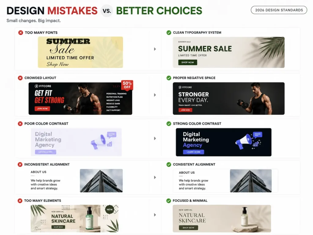
6. Using too many fonts and colors
The instinct when starting out is to add — more fonts, more colors, more elements. The professional instinct is to subtract. Two fonts maximum. Three colors maximum. Every element on the screen should earn its place.
7. Ignoring feedback and skipping critique
Feedback feels personal when you are new. It is not. It is data. Build a habit of sharing your work with other designers, asking for specific critique, and using it to improve. The fastest learners in any creative field are the ones who actively seek honest feedback rather than avoiding it.
8. Underpricing out of fear
Charging $10 for a design that took three hours does not make you more likely to get hired. In fact, extremely low pricing signals low quality to serious clients. Price according to the value of the market you are targeting, not the insecurity you are feeling.
9. Skipping the brief
Jumping straight into the visual before fully understanding the audience, the goal, the tone, and the competitive context is how you end up with three rounds of revisions and a confused client. Spend time on the brief before you spend time on the design.
10. Quitting during the “ugly middle”
Every designer goes through the phase where their taste exceeds their skill — where they can clearly see that their work is not as good as what they admire. This phase is a sign of growth, not failure. Push through it with reps. The skill catches up.
How to Get Your First Freelance Client
Once you have even two or three strong portfolio pieces, you are ready to start pitching. Here is the system that works.
The Reverse Pitch (Active Outreach)
As covered in the portfolio section, find businesses with a clear gap between the quality of their product and the quality of their visual brand. Do the work first. Send it cold. This method bypasses the competition entirely.
Local Business Networks
Small business owners in your city are often desperately underserved by good design. Attend local business events, introduce yourself, and show your portfolio. Word of mouth in a local network moves faster than any algorithm.
LinkedIn Targeted Outreach
Search for decision-makers in the industries you have designed for. Send a short, direct message: “I noticed your company is doing X, and I specialise in visual content for this type of brand. I recently designed something for a similar business and saw strong results. Would it be worth a quick conversation?”
Freelance Platforms as a Learning Tool
Platforms like Upwork and Fiverr are competitive, but they are useful for building early reviews and experience. Do not plan to stay there long-term, but they can provide the first few clients and testimonials you need to move to higher-value outreach.
How to Price Your Work as a Beginner
Pricing is the most emotionally difficult part of starting. Here is a clear framework.
Realistic Beginner Rates for Tier 1 Clients (US, UK, Canada, Australia)
| Project Type | Beginner Rate (USD) | What’s Included |
|---|---|---|
| Social media assets (3–4 carousels) | $150 – $300 | Strategic pack with hooks and layouts |
| Brand identity (basic) | $300 – $600 | Logo, typography, colour palette, mini brand guide |
| Presentation/pitch deck | $250 – $500 | 10–15 polished slides with layout system |
| Landing page design (Figma) | $400 – $800 | Desktop and mobile responsive layout |
Never quote $10–$20 for professional work. To Tier 1 clients, that price signals poor quality, not a bargain.
The Rule of 3 (Tiered Pricing)
Always present three options, not one. If a client only sees one price and it feels high, they walk. If they see three options, the conversation shifts from should I hire them to which option is right for me.
- Tier 1 (Basic): Minimum scope, entry price
- Tier 2 (Target): The package you actually want to sell — includes strategy and templates
- Tier 3 (Premium): Everything possible — the full system
The premium tier makes the target tier look like the obvious, reasonable choice.
The Case Study Discount
When pitching your very first client, offer a strategic one-time reduction: “My standard rate for this scope is $400. Because I am actively building out my portfolio with case studies in your industry, I will do this first project for $150 — in exchange for a written testimonial and permission to use the results in my portfolio.”
This positions you as high-value, not cheap. It gives the client an irresistible reason to say yes, and you walk away with both payment and proof of work.
Never Sell Single Posts
The single biggest pricing mistake beginners make is selling one-off deliverables. “One Instagram post — $25” puts you in commodity territory, where every client compares you to the cheapest option on any freelance platform.
Instead, sell systems. “A four-week visual content ecosystem — $400” is a solution to a month-long business problem. Clients pay for solutions, not files.
Best Free Resources to Keep Learning
YouTube Channels
- The Futur — brand strategy, design thinking, business side of design
- Flux Academy — practical UI/UX and freelance design
- Gareth David Studio — Adobe software tutorials for beginners
- Yes, I’m a Designer — career and practical skill-building
Websites and Inspiration
- Behance — professional portfolio work across every design niche
- Dribbble — curated, high-quality design inspiration
- Pinterest — build your taste and visual references
- Awwwards — for UI and web design inspiration
Free Tools
- Coolors.co — colour palette generator and contrast checker
- Google Fonts — hundreds of free, professional-quality fonts
- Unsplash / Pexels — free high-quality photography
- Canva Free — design practice and execution
Books Worth Reading
- The Non-Designer’s Design Book by Robin Williams — the best beginner book on design principles, written in plain language
- Thinking with Type by Ellen Lupton — the definitive guide to typography
Frequently Asked Questions
How long does it take to learn graphic design?
If you are consistent — practising daily, studying real work, and completing real projects — you can produce professional-quality work within three to four months. Getting your first paying client is realistic within two to three months if you are actively pitching. Mastery takes years, but competence that earns money is closer than most people think.
Can I teach myself graphic design without a degree?
Yes — and many of the best working designers are self-taught. The design industry values your portfolio above any qualification. What matters is whether your work solves problems and looks professional. A degree is one path. Consistent self-directed practice, real-world projects, and a strong portfolio is another — and in most cases, a faster one.
What is the best software to start with?
Start with Canva or Adobe Express. They remove the technical friction and let you focus entirely on learning the principles — hierarchy, contrast, colour, typography. Once your design thinking is solid, move to Figma for UI work or Adobe tools for more advanced projects. Do not let anyone tell you that starting with a simpler tool makes you less serious.
Do I need an expensive computer to start?
No. Canva and Figma run entirely in a browser. Any modern laptop or even a tablet with decent processing power will handle beginner design work. Invest in better hardware when your income from design justifies it.
How do I find my first client with no experience?
Use the Reverse Pitch method — find a local business with weak visual branding, redesign one piece of their content for free, and send it to them with a short, confident message. Even if they say no, you have a real case study. If they say yes, you have your first client. This method requires zero experience and bypasses every barrier that stops most beginners.
Graphic design is one of those skills that compound. Every design you create teaches you something. Every piece of feedback sharpens your judgment. Every client project builds your confidence. The only people who do not make it are the ones who stop.
Start today. Start imperfect. Keep going.