The Nintendo Switch 2 is officially here, and the hardware upgrades are undeniably massive. But right now, the internet isn’t arguing about magnetic controllers—they’re obsessing over the Nintendo Switch 2 logo. Is it a masterclass in brand equity, or just a lazy copy-paste job? Let’s break it down.
Nintendo knows how to build a visual identity. Over the decades, they’ve nailed the art of simple, sticky branding. Think of the NES pixel aesthetic. Or the Wii’s clean, casual vibe. The original Switch logo used clever negative space to literally “click” in your brain. It wasn’t just an icon. It was a promise of how you’d play. So, with expectations sky-high, did Nintendo drop the ball on the sequel’s branding?
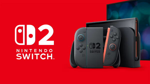
The Switch 2 Logo: A Familiar Look
Image Credit: Nintendo Switch 2
If you’ve seen the new design, you know it’s incredibly similar to the original. It keeps the classic Joy-Con silhouette and simply slaps a “2” next to it.
Honestly? It feels a bit too safe.
But from a marketing standpoint, iterative design makes sense. The original emblem is instantly recognizable globally. Keeping the core visual identity intact helps carry over millions of loyal users without friction. It’s clean, scalable, and impossible to misidentify. Sometimes, sticking to what works is the smartest business move.
What Fans Are Saying
Fans aren’t holding back. Across social media, graphic designers and gamers alike are calling the update “basic” and “uninspired.” The hardware brings serious innovation. The branding? Not so much.
Just open Reddit. You’ll find dozens of fan-made mockups where the “2” seamlessly integrates into the Joy-Con shape itself. These concepts prove the community is hungry for a bolder visual leap. Did Nintendo miss an easy design win? Probably.
Why Did Nintendo Keep It Simple?
So, why didn’t they go big? Brand equity. The Switch is an absolute juggernaut. Messing with a globally recognized logo risks confusing casual buyers.
Also, minimal design does heavy lifting. A simple logo keeps the spotlight on the product, not the packaging. While it doesn’t scream “next-gen,” it does exactly what it needs to do.
Crucial Lessons from the Switch 2 Logo
Whether you love it or hate it, this launch offers real takeaways for marketers and creatives.
1. Consistency Builds Trust
Don’t throw away brand equity for a shiny redesign. Keeping core elements from your previous iteration creates an instant bridge to your audience. You see the red Joy-Con shape, and you instantly know it’s Nintendo. Consistent branding is the foundation of consumer trust.
2. . Simplicity Scales Better
Complex logos break down on small screens. A minimal, flat design works flawlessly across UI elements, digital ads, and retail boxes. But remember the catch. Simplicity works best when it matches the product’s energy. If you strip down a design too much, you risk losing the brand’s personality.
3. Listen to Your Audience
Feedback from your audience can be a goldmine for improvement. When people share their thoughts – whether it’s praise or criticism – it shows that they care about your brand. Paying attention to their thoughts can help you see things from a new perspective.
With the Switch 2 logo, fans offered creative redesigns that made the “2” a more natural part of the symbol. These ideas highlight how engaged the community is and remind you that listening to feedback can inspire even better designs. When people feel they’ve been listened to, they’re more likely to remain loyal to your brand.
Final Verdict: Too Simple?
It all comes down to what you value more: bold creativity or calculated consistency. Nintendo chose the safe route. They protected their multi-billion-dollar brand identity. But for design nerds, it’s definitely a missed opportunity.
What’s your take? Is the simple approach a quiet genius move, or did Nintendo play it too safe? Either way, the debate proves one thing. Good design always starts a conversation.
I’m Akash Makhnotra, a graphic designer and creative entrepreneur with over 8 years of experience in the design industry. I’m the creator behind ResourcePik, where I personally manage everything from design resources and content creation to creative tools and website management.
Over the years, I’ve worked on branding, social media creatives, mockups, visual identity design, and digital design resources for brands, businesses, and creators. My focus is on creating clean, modern, and practical design resources that help creatives work faster and produce better visuals.
At ResourcePik, I create and publish mockups, textures, fonts, templates, text effects, and other creative assets for designers and content creators. I’ve also personally built tools like the Font Pairing Tool, Color Palette Generator, LUTs Generator, and Gradient Generator to help designers improve their workflow and creativity.
Alongside resources and tools, I also share design tutorials, branding insights, and AI-related creative content to help designers stay updated with modern trends and workflows.
For me, design is not just about visuals. It’s about solving problems, building strong brand experiences, and creating work that feels professional and impactful.