Design feeds have been noisy this year. Every week brings a new aesthetic, a new tool, a new “trend of the moment.” It gets hard to figure out what’s genuinely shifting and what’s just algorithm bait.
So this article cuts through that. It covers the real graphic design trends shaping 2026 — where they’re coming from, which ones are worth your time, and which ones designers are already tired of. Plus, what’s actually fading out (that part is just as useful).
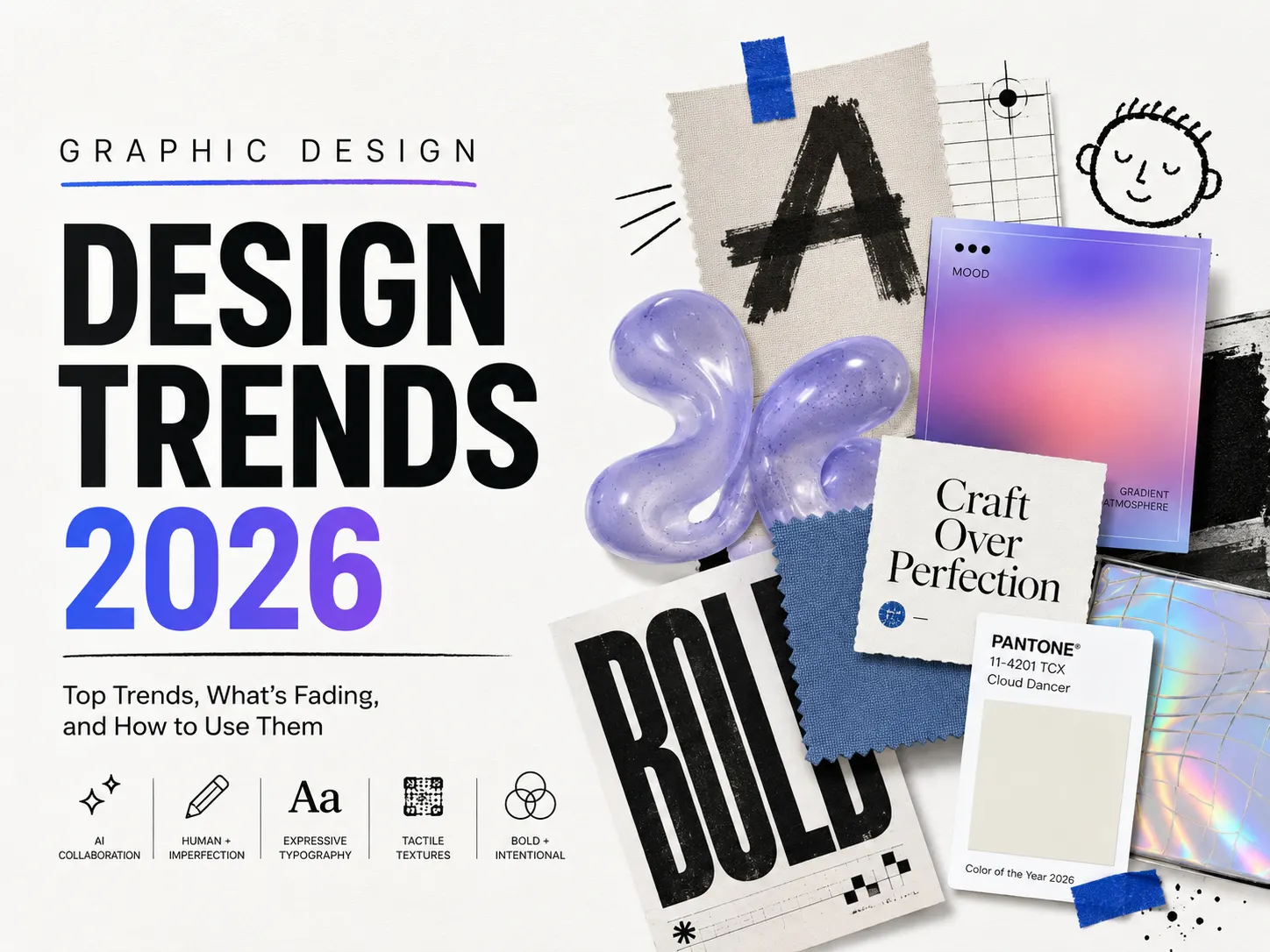
What are the top graphic design trends in 2026?
The biggest graphic design trends in 2026 include AI-assisted design, human-centric imperfection, liquid and experimental typography, tactile craft textures, retro-futurism, neo-brutalism, bold minimalism, and nature-inspired visuals. The central theme that connects them is a tension between synthetic polish and raw human expression.
Why 2026 Feels Different From Any Other Year
The reason 2026 feels like a turning point isn’t one single thing. It’s a combination.
AI tools have gone from “interesting experiment” to a standard part of many designers’ workflows. According to Figma’s State of the Designer 2026 report, 72% of designers now use generative AI in their day-to-day work — and 91% of them say it improves the quality of their output, not just their speed.
That adoption has triggered a counter-reaction.
The more AI-generated content floods every feed, the more people crave something that looks and feels human. That tension — machine efficiency vs human imperfection — is the undercurrent running through almost every trend this year.
1. AI as a Design Collaborator (Not a Replacement)
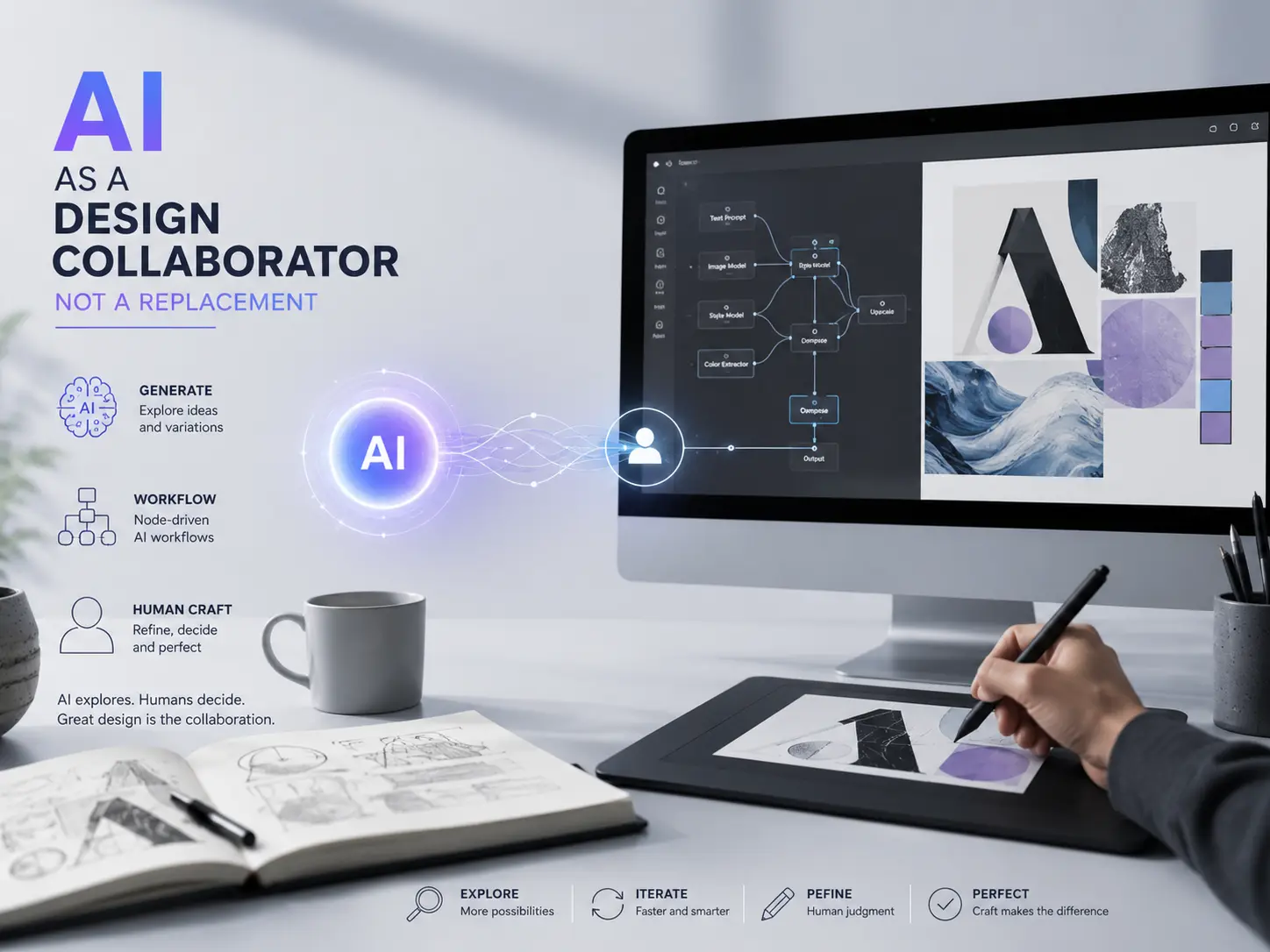
The conversation around AI in design has matured. In 2024, it was panic or hype. In 2026, most working designers have settled somewhere more practical.
AI is being used as a generative collaborator — a way to explore unexpected forms, compositions, and textures early in the process. The human designer still makes the directional decisions, refines the output, and decides what makes it to the final file.
Designers are also using node-driven interfaces to build visual AI workflows — connecting models, prompts, data, and logic in a modular way that makes complex generation easier to control and repeat. This approach gives full transparency over what the AI is producing and why.
What AI still can’t do well: the micro-level detail work. The subtle texture in the background at 800% zoom. The intentional imbalance of elements that creates visual tension. Those small, considered decisions — the kind that take years of experience to develop — are still what separate competent AI-assisted design from genuinely strong design.
That gap is where human craft lives in 2026.
Free resources: [Free AI-tools and design starter assets] are useful here — good for testing directions before committing to a final approach.
2. Human-Centric Design and the Beauty of Imperfection
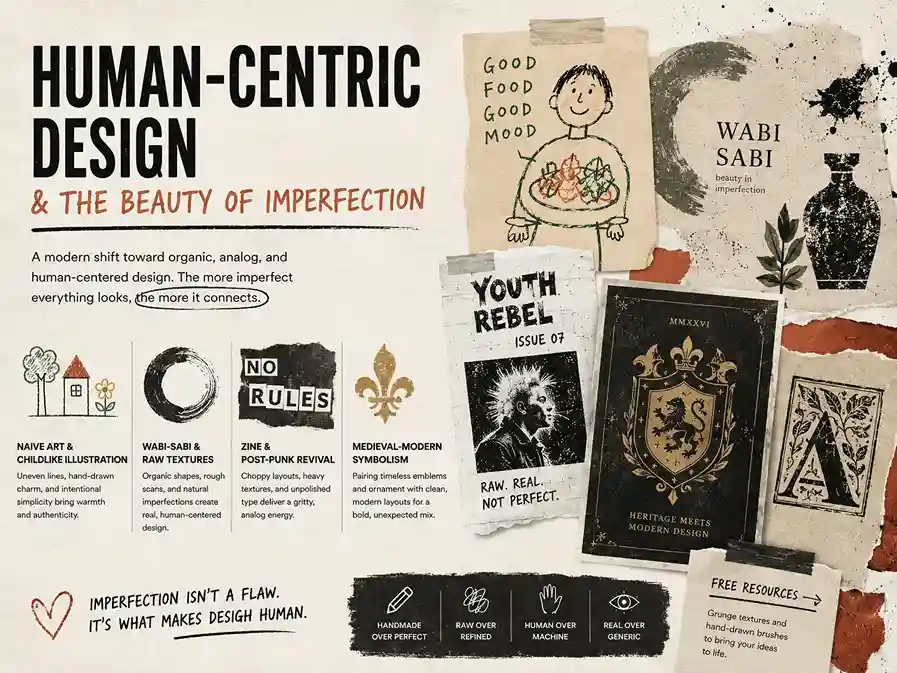
This is the direct response to AI saturation.
Adobe’s 2026 Creative Trends Forecast puts it clearly: the heavy influence of AI, AR, and gaming is ironically driving a backlash toward organic, analog, and human-centered design. The more perfect everything looks, the more imperfect work stands out.
Naive art and childlike illustration
Naive design — think childlike drawings, uneven lines, hand-lettered type — is everywhere right now. It’s not about lack of skill. It’s intentional. Audiences who are used to seeing hyper-polished, AI-optimised visuals find something genuinely refreshing about work that looks like a human made it without overthinking.
It works especially well for food brands, independent businesses, and anything where warmth and approachability matter more than precision.
Wabi-sabi and raw textures
Wabi-sabi — the Japanese concept of finding beauty in imperfection — is influencing brand design more than you’d expect. Hand-drawn textures, rough scans, organic shapes that don’t quite line up. This aesthetic says: we’re not trying to look like a tech company. We’re trying to look real.
Yeasin Al Rahat, a designer from the Dribbble by Vista community, summed it up well: “After years of AI-generated perfection, designers are creating work that feels human again. This trend is about control through mess — grabbing attention in a noisy world by leaning into discomfort. People are tired of generic. This is the antidote.”
The zine and post-punk revival
Post-punk visual culture is back — choppy layouts, heavy analog textures, deliberately unpolished type. The zine aesthetic, which thrives on imperfect, lo-fi production, is showing up in brand campaigns and editorial design. It acts as a gritty, human counterbalance to anything that looks too clean or AI-made.
Medieval-modern symbolism
This one surprises most people. According to Sessions.edu’s 2026 trend analysis, an increasing number of designers are pairing medieval iconography — heavy emblems, earthy palettes, historical ornament — with clean contemporary frameworks. The result is unexpectedly striking. It’s not medieval cosplay; it’s taking that visual richness and grounding it in modern layout.
Free resources: [Free grunge texture packs] and [hand-drawn Photoshop brush sets] work well for any of these directions.
3. Typography Breaking All the Rules
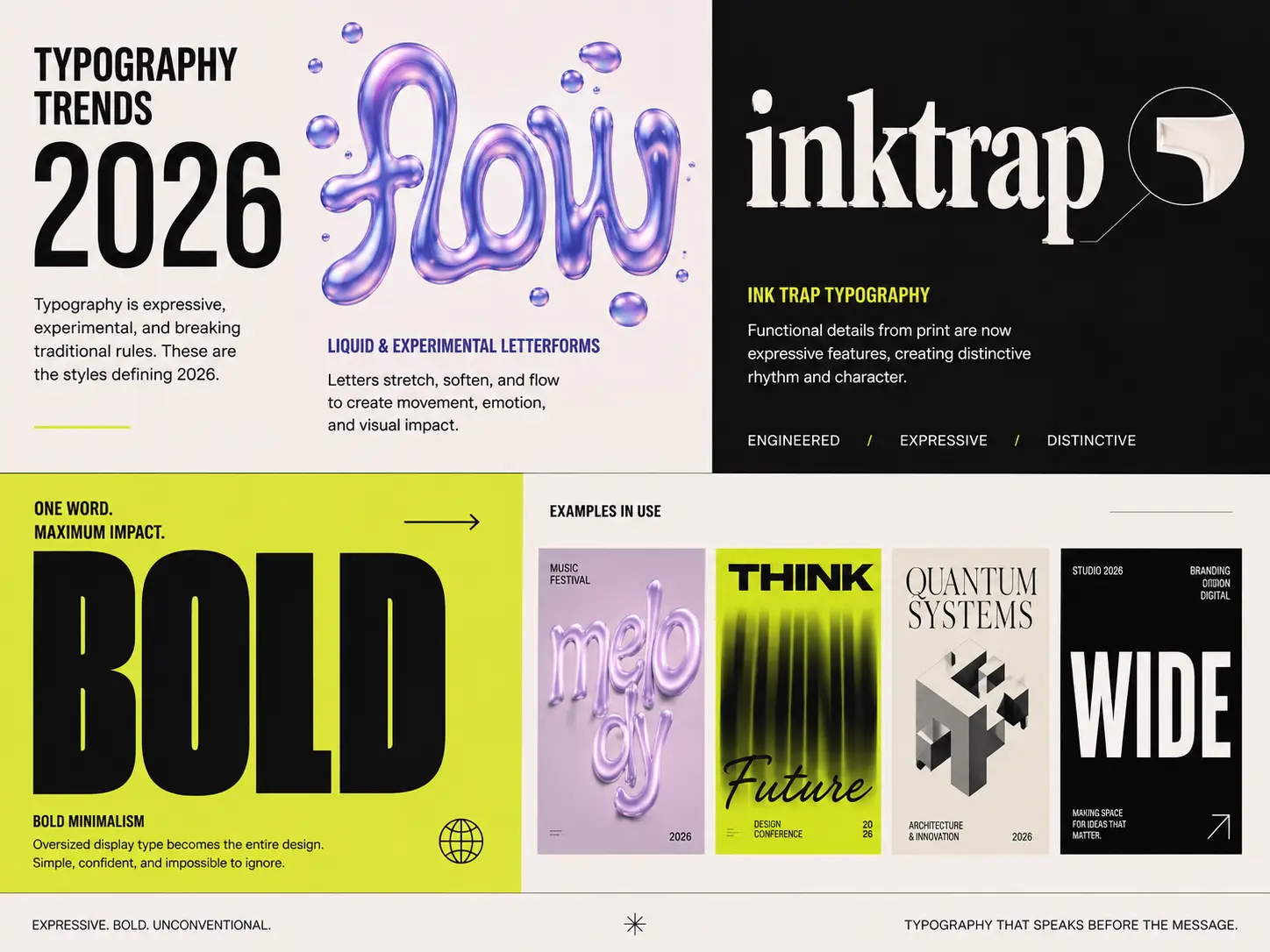
Typography is having one of its more interesting years. The constraints are gone. Letterforms are being treated more like visual objects than functional text.
Liquid and experimental letterforms
Liquid typography — where letters stretch, soften, blur, and flow — is being used to suggest movement even in static compositions. The key is that it’s deliberate, not chaotic. You’ll typically see it in display type and brand moments where emotion matters more than pure legibility.
This is especially strong in digital branding, where there’s room to be expressive.
Ink trap typography
Ink traps were originally a print solution — small cuts in the corners of letterforms to prevent ink bleeding. In 2026, designers are amplifying those details as a stylistic choice. The result is type that feels engineered and expressive at the same time. It has a distinctive rhythm that works well for brands that want to feel considered and slightly technical.
Oversized display type as the whole design
You’ve probably noticed this: sometimes the headline is the design. One word, extremely large, paired with generous white space and maybe a single accent color. Nothing else needed.
This approach to bold minimalism is everywhere — on posters, packaging, landing pages. It works because it takes confidence to strip away everything except the message. Done right, it’s more impactful than anything busy.
Quick answer — what typography styles are trending in graphic design in 2026?
Liquid and elastic letterforms, ink trap-influenced type, and oversized display headlines are the dominant typography trends in 2026. Expressive, unconventional type is being used as the primary design element rather than a supporting component.
Free resources: Several [free display and experimental fonts] are available that suit liquid, ink trap, and oversized headline styles.
4. Tactile Textures and the Craft Revival
There’s a consistent demand signal this year: people want to feel something. Literally.
Adobe’s 2026 Creative Trends Forecast notes that harnessing tactile and sensory experiences is a strong driver of engagement this year. As more time is spent on screens, materials that mimic touch — puffy 3D objects, squishy textures, soft fabric-like surfaces — are resonating harder.
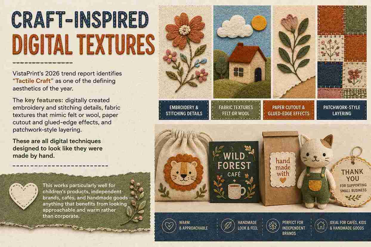
Craft-inspired digital textures
VistaPrint’s 2026 trend report identifies “Tactile Craft” as one of the defining aesthetics of the year. The key features: digitally created embroidery and stitching details, fabric textures that mimic felt or wool, paper cutout and glued-edge effects, and patchwork-style layering. These are all digital techniques designed to look like they were made by hand.
This works particularly well for children’s products, independent brands, cafés, and handmade goods — anything that benefits from looking approachable and warm rather than corporate.
Folk art and regional aesthetics
After years of globally homogeneous digital design, regional aesthetics are making a strong comeback. VistaPrint’s community research found that Northern European folk patterns — florals, animals, ornamental borders — are being brought into modern compositions in a way that feels warm and joyful, not nostalgic.
Canva’s 2026 trend report also highlights Indian heritage maximalism as a rising global trend — the rich patterns and bold color combinations of Indian visual culture being remixed with contemporary design frameworks.
This is a genuine shift: local and cultural identity in design is being seen as a strength, not a limitation.
Mixed media compositions
Photography, illustration, typography, and texture living in the same layout. Mixed media reflects a broader rejection of flatness — both visually and conceptually. Single-medium compositions are starting to look thin compared to work that layers multiple visual languages together.
Free resources: [Free texture packs] and [paper effect Photoshop brushes] are a quick way to add tactile depth to digital work.
5. Nostalgia With a Modern Edge
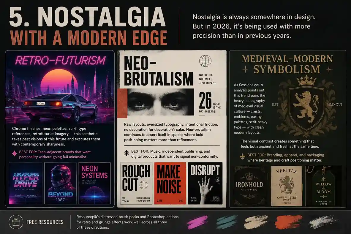
Nostalgia is always somewhere in design. But in 2026, it’s being used with more precision than in previous years.
Retro-futurism
Chrome finishes, neon palettes, sci-fi type references, retrofuturist imagery — this aesthetic takes past visions of the future and executes them with contemporary sharpness. The tension between old-school optimism and modern production values makes it visually interesting.
It works best for tech-adjacent brands that want personality without going full minimalist.
Neo-brutalism
Raw layouts, oversized typography, intentional friction, no decoration for decoration’s sake. Neo-brutalism continues to assert itself in spaces where bold positioning matters more than refinement. It’s confrontational in a useful way — you know immediately whether you’re the target audience or not.
It’s especially strong in music, independent publishing, and digital products that want to signal non-conformity.
Medieval-modern symbolism (the unexpected one)
As Sessions.edu’s analysis points out, this trend pairs the heavy iconography of medieval visual culture — crests, emblems, earthy palettes, serif-heavy type — with clean modern layouts. It sounds unusual but the visual contrast creates something that feels both ancient and fresh at the same time.
The trend is gaining traction in branding, apparel, and packaging where heritage and craft positioning matter.
Free resources: [Distressed Photoshop brush packs] and [retro and grunge Photoshop actions] work well across all three of these directions.
6. Color in 2026: What’s Actually Happening
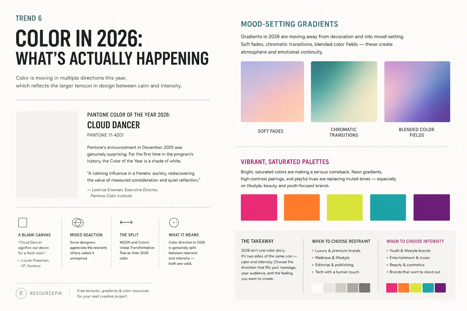
Color is moving in multiple directions this year, which reflects the larger tension in design between calm and intensity.
Pantone Color of the Year 2026: Cloud Dancer
Pantone’s announcement in December 2025 was genuinely surprising. For the first time in the program’s history, the Color of the Year is a shade of white — Cloud Dancer (PANTONE 11-4201).
Leatrice Eiseman, executive director of the Pantone Color Institute, described it as “a calming influence in a frenetic society, rediscovering the value of measured consideration and quiet reflection.” Pantone’s vice president Laurie Pressman called it a blank canvas: “Cloud Dancer signifies our desire for a fresh start.”
The reaction online was mixed. Some designers appreciated the restraint; others called it uninspired (one viral meme renamed it “landlord white”). Meanwhile, trend forecasters WGSN and Coloro went the other direction entirely, choosing Transformative Teal as their 2026 color.
What this split tells you is that color direction in 2026 is genuinely split between restraint and intensity — both are valid, depending on what you’re designing and who for.
Mood-setting gradients
Gradients in 2026 are moving away from decoration and into mood-setting. Soft fades, chromatic transitions, blended color fields — these create atmosphere and emotional continuity rather than visual noise. The goal is to make the viewer feel something before they read anything.
Vibrant, saturated palettes (dopamine design)
On the opposite end: bright, saturated colors are making a serious comeback. According to Figma’s web design trend report, neon gradients, high-contrast pairings, and playful hues are replacing muted tones — especially on lifestyle, beauty, and youth-focused brands.
Adobe’s forecast echoes this: bold, saturated color paired with surreal elements creates immersive visual experiences that perform well in digital contexts.
These two color directions coexist in 2026 because they serve different purposes. White space and restraint for brands that want to signal calm, clarity, and quality. Saturated intensity for brands that want energy, playfulness, and directness.
7. 3D Design and Motion
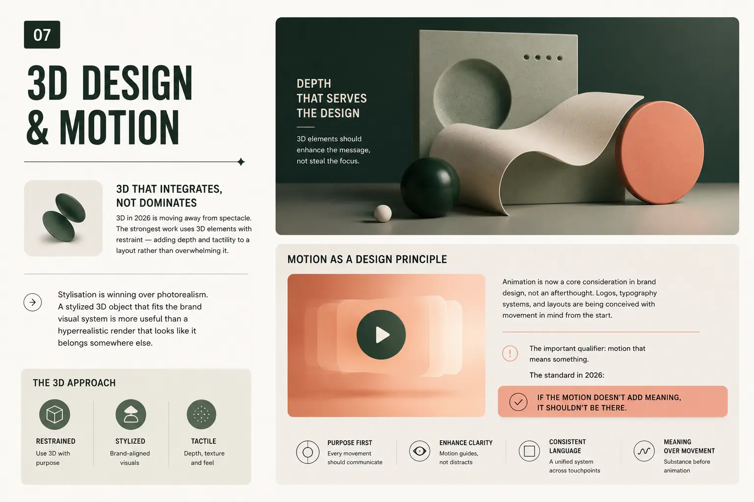
3D that integrates, not dominates
3D in 2026 is moving away from spectacle. The strongest work uses 3D elements with restraint — adding depth and tactility to a layout rather than overwhelming it. Stylisation is winning over photorealism. A stylized 3D object that fits the brand visual system is more useful than a hyperrealistic render that looks like it belongs somewhere else.
Motion as a design principle
Animation is now a core consideration in brand design, not an afterthought. Logos, typography systems, and layouts are being conceived with movement in mind from the start.
The important qualifier: motion that means something. As Creative Boom’s April 2026 designer survey highlighted, “motion for motion’s sake” is one of the things designers are most tired of right now. Animated brand guidelines that move a great deal while communicating very little. Kinetic typography on social posts adds nothing. One designer in the survey called it “dishonesty” — animation as decoration rather than communication.
The standard in 2026: if the motion doesn’t add meaning, it shouldn’t be there.
8. The Maximalism vs Minimalism Paradox (Explained)
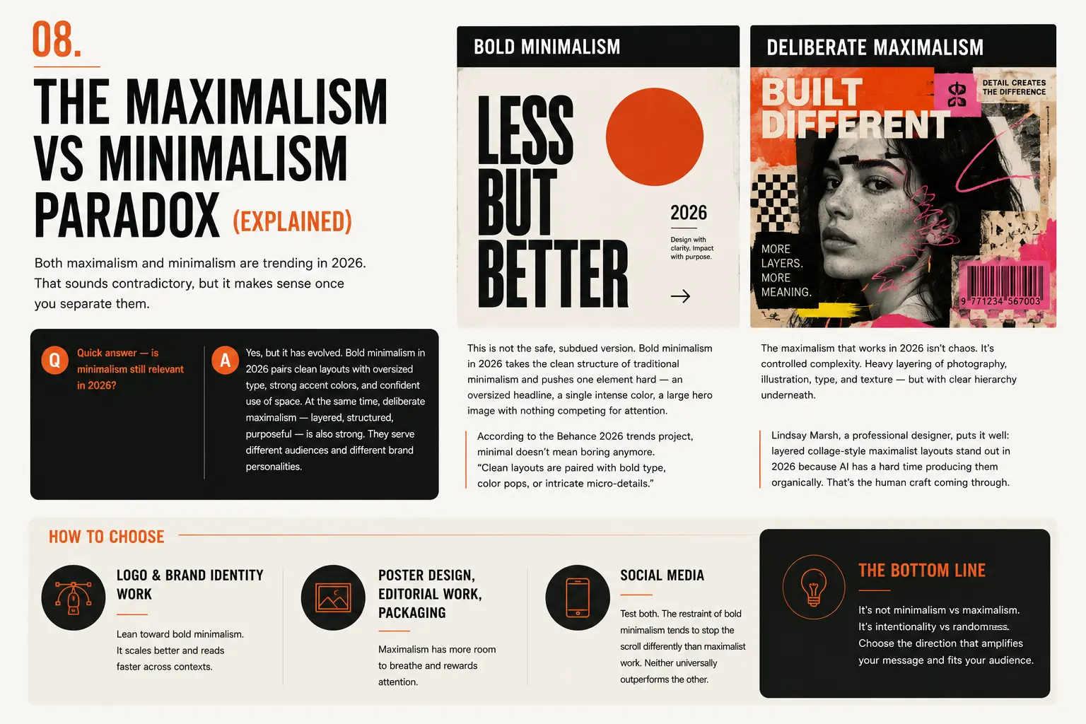
Both maximalism and minimalism are trending in 2026. That sounds contradictory, but it makes sense once you separate them.
Quick answer — is minimalism still relevant in 2026?
Yes, but it has evolved. Bold minimalism in 2026 pairs clean layouts with oversized type, strong accent colors, and confident use of space. It’s nothing like the quiet, beige minimalism of a few years ago. At the same time, deliberate maximalism — layered, structured, purposeful — is also strong. They serve different audiences and different brand personalities.
Bold minimalism
This is not the safe, subdued version. Bold minimalism in 2026 takes the clean structure of traditional minimalism and pushes one element hard — an oversized headline, a single intense color, a large hero image with nothing competing for attention. According to the Behance 2026 trends project, minimal doesn’t mean boring anymore. “Clean layouts are paired with bold type, color pops, or intricate micro-details.”
Deliberate maximalism
The maximalism that works in 2026 isn’t chaos. It’s controlled complexity. Heavy layering of photography, illustration, type, and texture — but with clear hierarchy underneath. Lindsay Marsh, a professional designer who has been tracking these trends closely, puts it well: layered collage-style maximalist layouts stand out in 2026 precisely because AI has a hard time producing them organically. The imbalance, the micro-detail, the tension between elements — that’s the human craft coming through.
How to choose
Logo and brand identity work: lean toward bold minimalism. It scales better and reads faster across contexts.
Poster design, editorial work, packaging: maximalism has more room to breathe and rewards attention.
Social media: test both. The restraint of bold minimalism tends to stop the scroll differently than maximalist work. Neither universally outperforms the other.
9. Graphic Design Trends That Are Fading Out in 2026
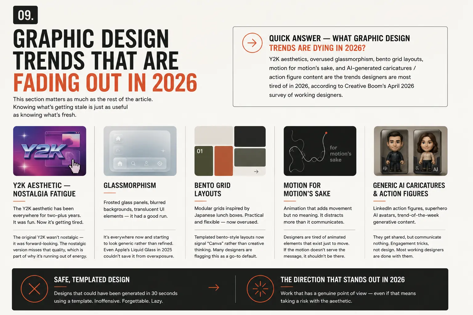
This section matters as much as the rest of the article. Knowing what’s getting stale is just as useful as knowing what’s fresh.
Quick answer — what graphic design trends are dying in 2026?
Y2K aesthetics, overused glassmorphism, bento grid layouts, motion for motion’s sake, and AI-generated caricatures/action figure content are the trends designers are most tired of in 2026, according to Creative Boom’s April 2026 survey of working designers.
Y2K aesthetic — nostalgia fatigue
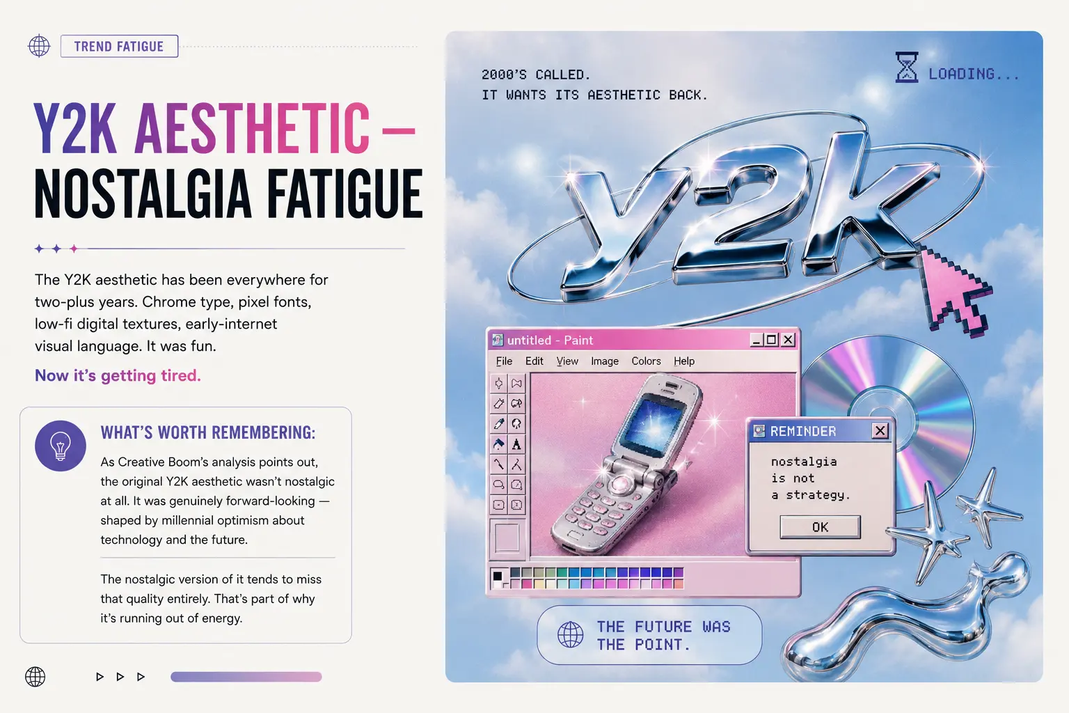
The Y2K aesthetic has been everywhere for two-plus years. Chrome type, pixel fonts, low-fi digital textures, early-internet visual language. It was fun. Now it’s getting tired.
What’s worth remembering: as Creative Boom’s analysis points out, the original Y2K aesthetic wasn’t nostalgic at all. It was genuinely forward-looking — shaped by millennial optimism about technology and the future. The nostalgic version of it tends to miss that quality entirely. That’s part of why it’s running out of energy.
Glassmorphism
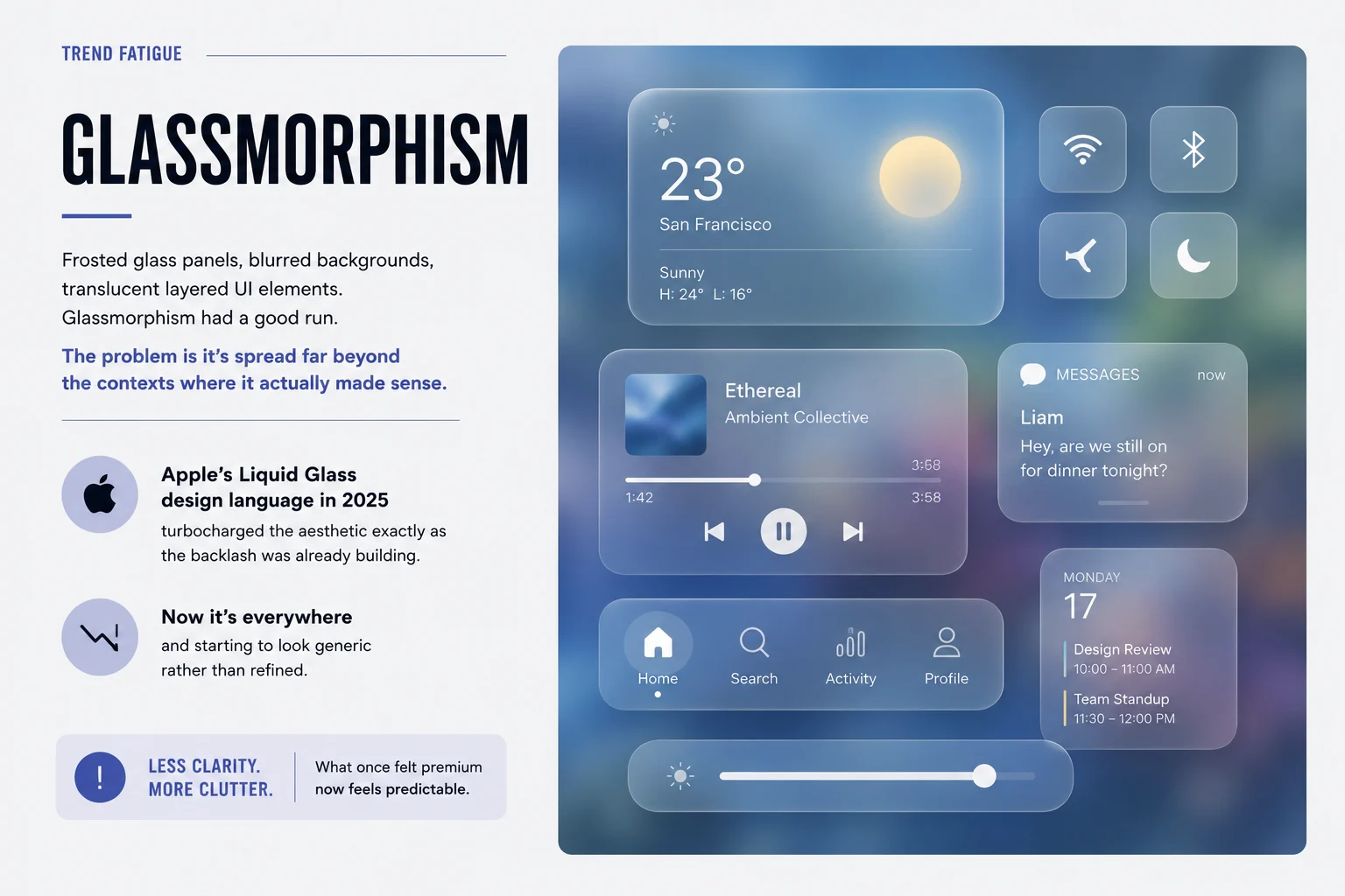
Frosted glass panels, blurred backgrounds, translucent layered UI elements. Glassmorphism had a good run. The problem is it’s spread far beyond the contexts where it actually made sense.
Apple’s announcement of its Liquid Glass design language in 2025 turbocharged the aesthetic exactly as the backlash was already building. Now it’s everywhere and starting to look generic rather than refined.
Bento grid layouts
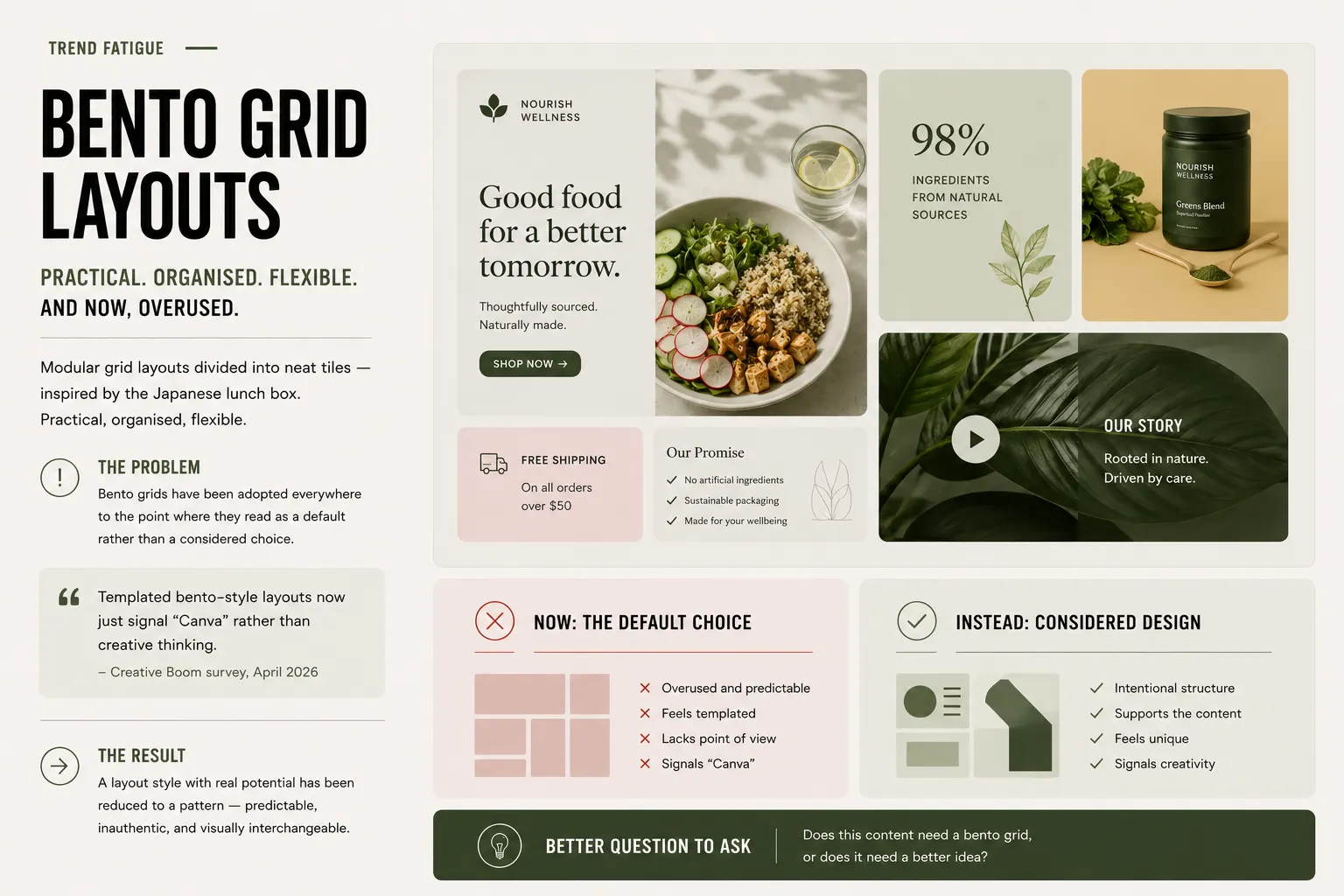
Modular grid layouts divided into neat tiles — inspired by the Japanese lunch box. Practical, organised, flexible. Also now overused to the point where it reads as a default rather than a considered choice. Several designers in Creative Boom’s survey flagged this directly, noting that templated bento-style layouts now just signal “Canva” rather than creative thinking.
Generic AI caricatures and action figures
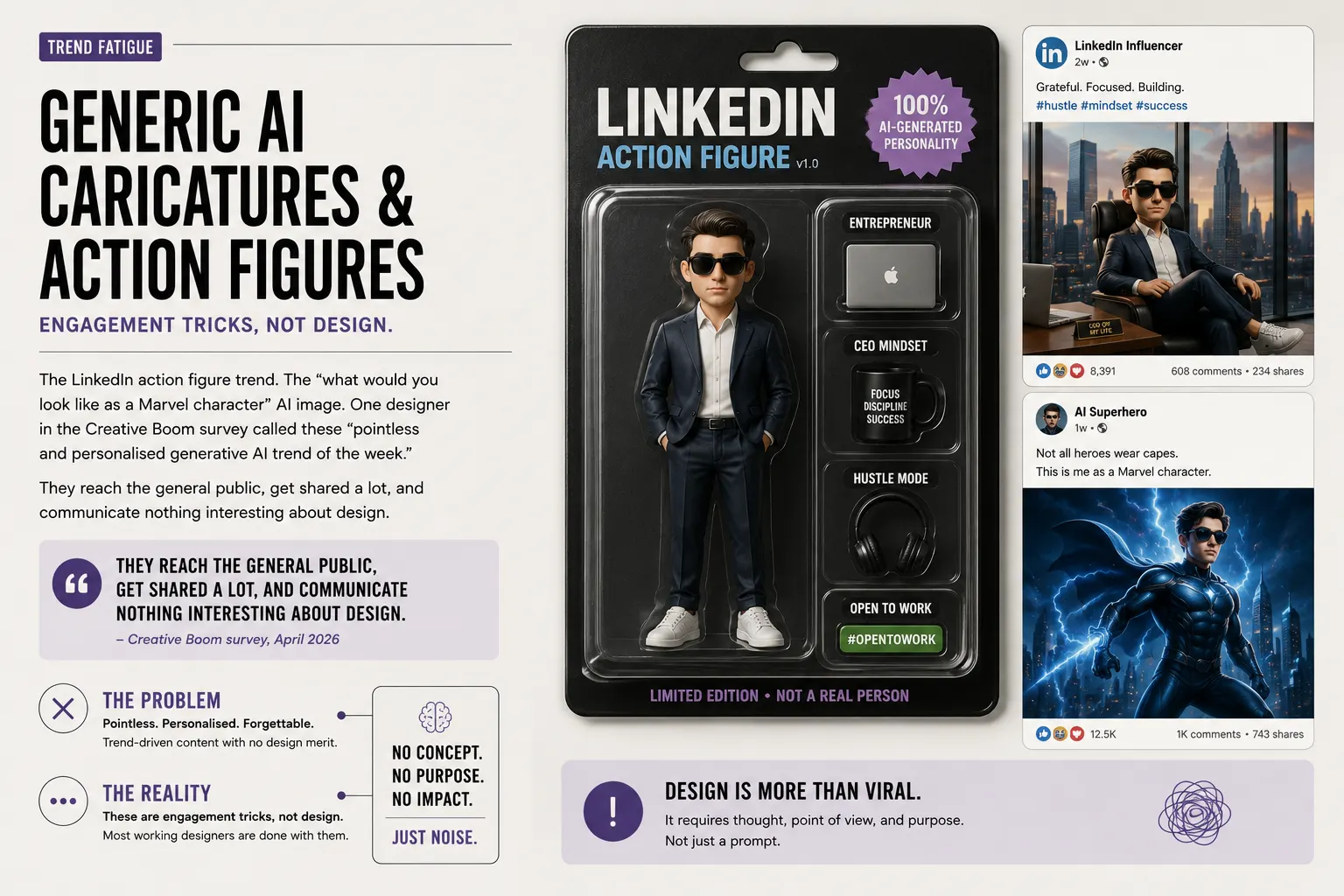
The LinkedIn action figure trend. The “what would you look like as a Marvel character” AI image. One designer in the Creative Boom survey called these “pointless and personalised generative AI trend of the week.” They reach the general public, get shared a lot, and communicate nothing interesting about design.
These are engagement tricks, not design. Most working designers are done with them.
Safe, templated design
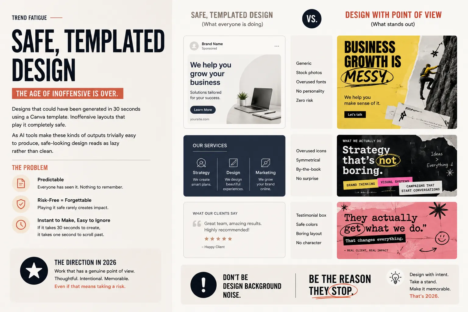
This one is broader. Designs that could have been generated in 30 seconds using a Canva template. Inoffensive layouts that play it completely safe. As AI tools make these kinds of outputs trivially easy to produce, a safe-looking design reads as lazy rather than clean.
The direction that stands out in 2026 is work that has a genuine point of view — even if that means taking a risk with the aesthetic.
10. Applying 2026 Design Trends to Your Actual Work
Knowing the trends is one thing. Knowing where to use them is another.
Logo and brand identity design
Human-centric imperfection, bold minimalism, and ink trap typography translate well to identity design. The key is that a logo needs to work at a postage stamp size and on a billboard. Liquid typography and maximalist layering are harder to deploy here unless the application is very specific.
Folk art motifs and medieval-modern symbolism are strong for heritage brands, food, craft beverages, and anything where cultural depth adds meaning.
Social media graphics
This is where bold type and dopamine palettes perform best. Clear hierarchy, a single strong visual message, and enough visual energy to stop someone mid-scroll.
Tactile textures and hand-drawn elements also work well because they look distinctly non-AI in a feed full of smooth, generated imagery.
Print, packaging, and poster design
Maximalism and tactile craft textures shine here. Print gives tactility a physical dimension that screens can’t replicate, so designs that play on textures, embossed-style effects, and layered compositions feel right at home.
Neo-brutalism is a strong choice for posters and editorial work where impact matters more than warmth.
Web and UI design
3D integration, motion with meaning, and vibrant color palettes are most at home in digital products. Accessibility remains a real consideration — high-contrast color palettes and clear hierarchy are increasingly non-negotiable, not just good practice.
11. Free Resources to Use These Trends
You don’t need expensive tools to work with 2026’s dominant aesthetics. Most of what you need is available free.
Fonts for typography trends — Resourcepik’s free font collection includes display, experimental, and serif options suited to liquid, ink trap, and oversized headline styles.
Texture packs and brushes — For tactile craft, grunge, and mixed media work, Resourcepik’s free Photoshop brush packs and texture downloads cover most of what you need without starting from scratch.
Mockups — Presenting trend-forward work in realistic contexts matters. Resourcepik’s free mockup library covers packaging, devices, print, and apparel.
Photoshop actions — Grunge effects, retro film treatments, and distressed overlays — Resourcepik’s free Photoshop actions are a quick way to add analog character to digital work.
Illustrations and vectors — For folk art aesthetics and organic visuals, Resourcepik’s free illustration sets and vector packs give you a starting point.
Frequently Asked Questions
What is the biggest graphic design trend in 2026?
The single biggest shift is the tension between AI-generated design and human-centric expression. Most specific trends this year — imperfection, handmade textures, naive illustration, tactile craft — are responses to the polish and homogeneity that AI tools can easily produce.
Is minimalism still in style in 2026?
Yes, but it’s evolved. Bold minimalism — clean layouts with strong typography, confident color, and intentional white space — is very much current. What’s fading is the quiet, neutral, barely-there minimalism that dominated a few years ago. Minimalism now needs a point of view.
What graphic design trends are dying in 2026?
Y2K aesthetics, glassmorphism, bento grid layouts used everywhere, motion without purpose, and generic AI-generated caricatures/action figure content. These are the trends that working designers consistently flagged as overused in Creative Boom’s April 2026 survey.
How is AI changing graphic design in 2026?
AI is now a standard part of many designers’ workflows — Figma’s State of the Designer 2026 report found that 72% of designers use generative AI and 91% say it improves quality. The bigger cultural shift is that AI’s widespread use is pushing demand for work that’s visibly human, imperfect, and handcrafted.
What colors are trending in graphic design for 2026?
Two directions at once. Pantone’s Color of the Year 2026 is Cloud Dancer (PANTONE 11-4201) — a soft, near-white shade representing calm and restraint. At the same time, vibrant, saturated palettes (dopamine design) are making a strong comeback, particularly for digital and youth-focused brands. Mood-setting gradients are also significant — used for atmosphere rather than decoration.
What typography is popular in 2026?
Liquid and experimental letterforms, ink-trap-influenced type, and oversized display headlines dominate. Typography is being treated as a primary visual element rather than a supporting one. Free bold display and experimental fonts are widely available if you want to experiment without cost.
Which 2026 design trends will carry into 2027?
Human-centric design, AI collaboration, and tactile textures are the most likely to persist — they’re not aesthetic fads but responses to structural shifts in how design is made and consumed. Y2K, glassmorphism, and bento grids are already declining, which suggests any remaining momentum there will be limited. Retro-futurism and neo-brutalism both have staying power for specific brand contexts.
Final Thought
The common thread across 2026’s strongest trends is intentionality. The work that stands out isn’t chasing novelty — it’s making deliberate choices about what belongs in a composition and what doesn’t.
That’s true whether you’re leaning into maximalist layering or bold minimalism, AI-assisted generation or entirely hand-drawn work. The question isn’t which trend to follow. It’s whether the choice you’ve made has a reason behind it.
If it does, you’re ahead of most of what’s out there.
All the free fonts, textures, mockups, brushes, and browser-based design tools mentioned above are available at Resourcepik — no cost, no account needed.